Aeon Video has a monthly newsletter!
Get curated editors’ picks, peeks behind the scenes, film recommendations and more.
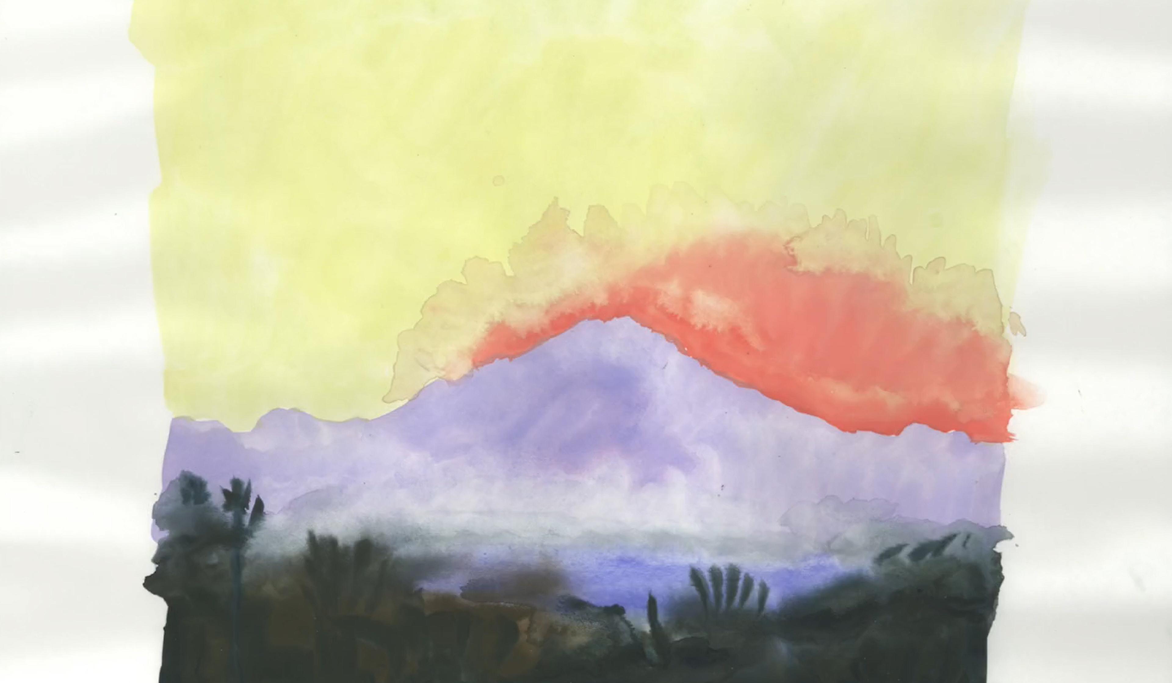
Ugly on purpose: the intentionally drab desperation of Van Gogh’s ‘The Night Café’
One of the techniques for which Vincent van Gogh is celebrated is his evocative and striking use of colour contrast. In many of his most famous works – including Café Terrace at Night (1888), The Starry Night (1889) and Irises (1889) – his palette is soothing and inviting, yielding scenes destined to hang, for generations to come, on the walls of dorm rooms and doctors’ offices. However, this video essay from Evan Puschak (also known as the Nerdwriter) finds genius in the drab hues of Van Gogh’s somewhat lesser-known work The Night Café (1888) – a painting that was, by the artist’s own admission, ‘one of the ugliest I’ve done’. Probing Van Gogh’s personal letters and acute understanding of colour theory, Puschak examines how the painter deployed clashing, desolate greens and reds in the work ‘to express the terrible passions of humanity’.
Video by The Nerdwriter
video
Music
The peculiar beauty of a song caught between composition and improvisation
3 minutes

video
Rituals and celebrations
A beginner’s guide to a joyful Persian tradition of spring renewal and rebirth
3 minutes

video
Love and friendship
Love looks a bit different for a chain-smoking couple in a small apartment
11 minutes

video
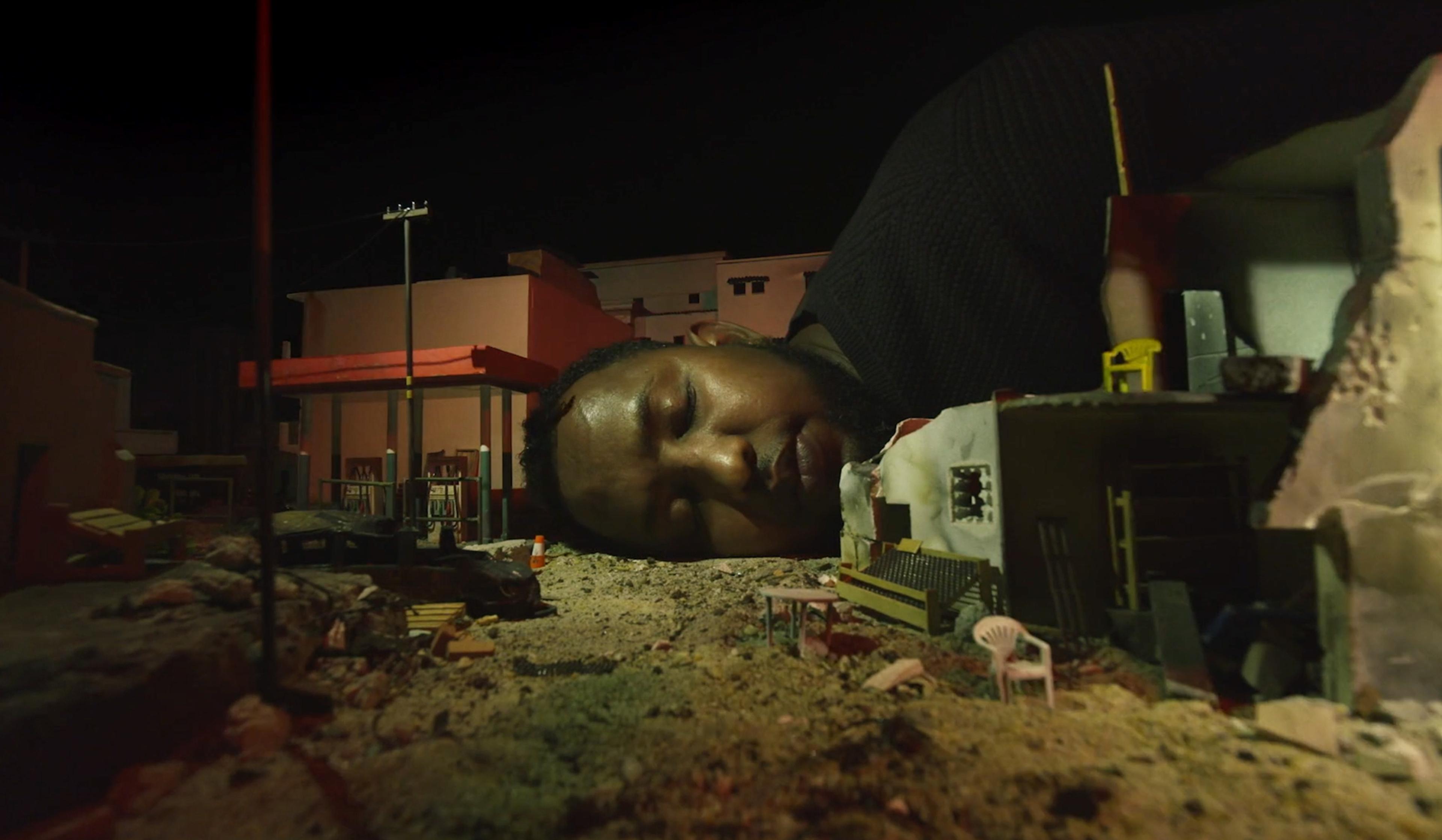
Biography and memoir
Passed over as the first Black astronaut, Ed Dwight carved out an impressive second act
13 minutes
video
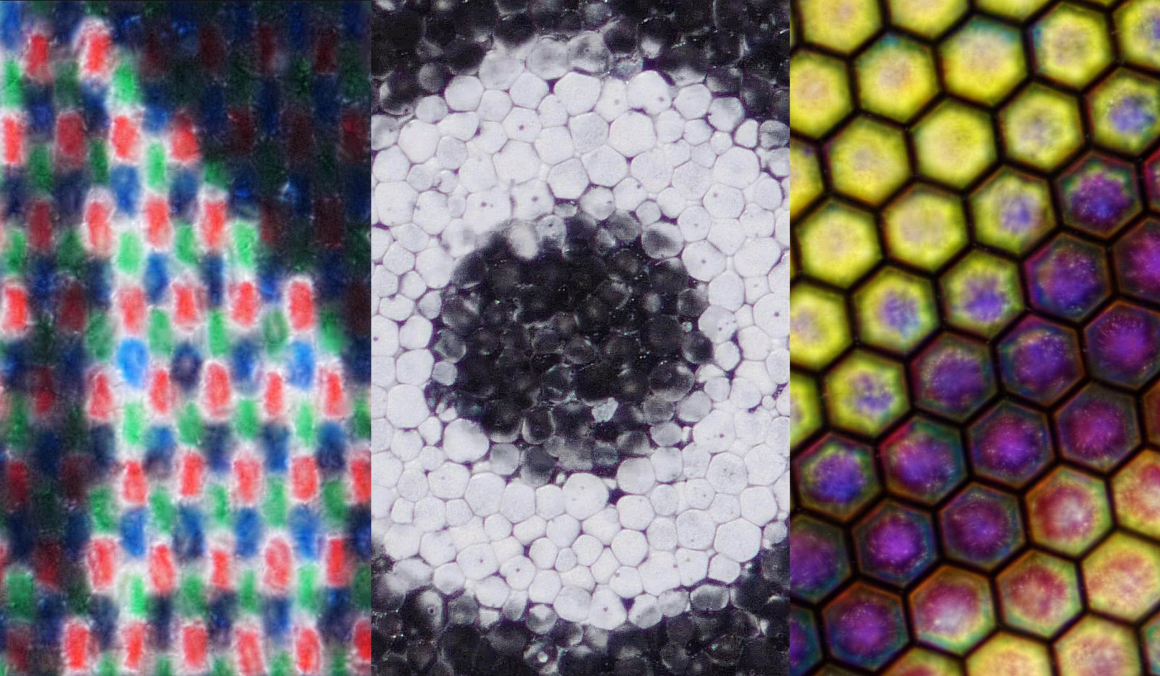
Engineering
A close-up look at electronic paper reveals its exquisite patterns – and limitations
9 minutes

video
Architecture
West Africa was once an architectural laboratory. Is it time for a revival?
12 minutes

video
Work
A Swedish expat in the Philippines wonders: what’s up with people sleeping at work?
14 minutes
video
Biography and memoir
The unique life philosophy of Abdi, born in Somalia, living in the Netherlands
29 minutes
video
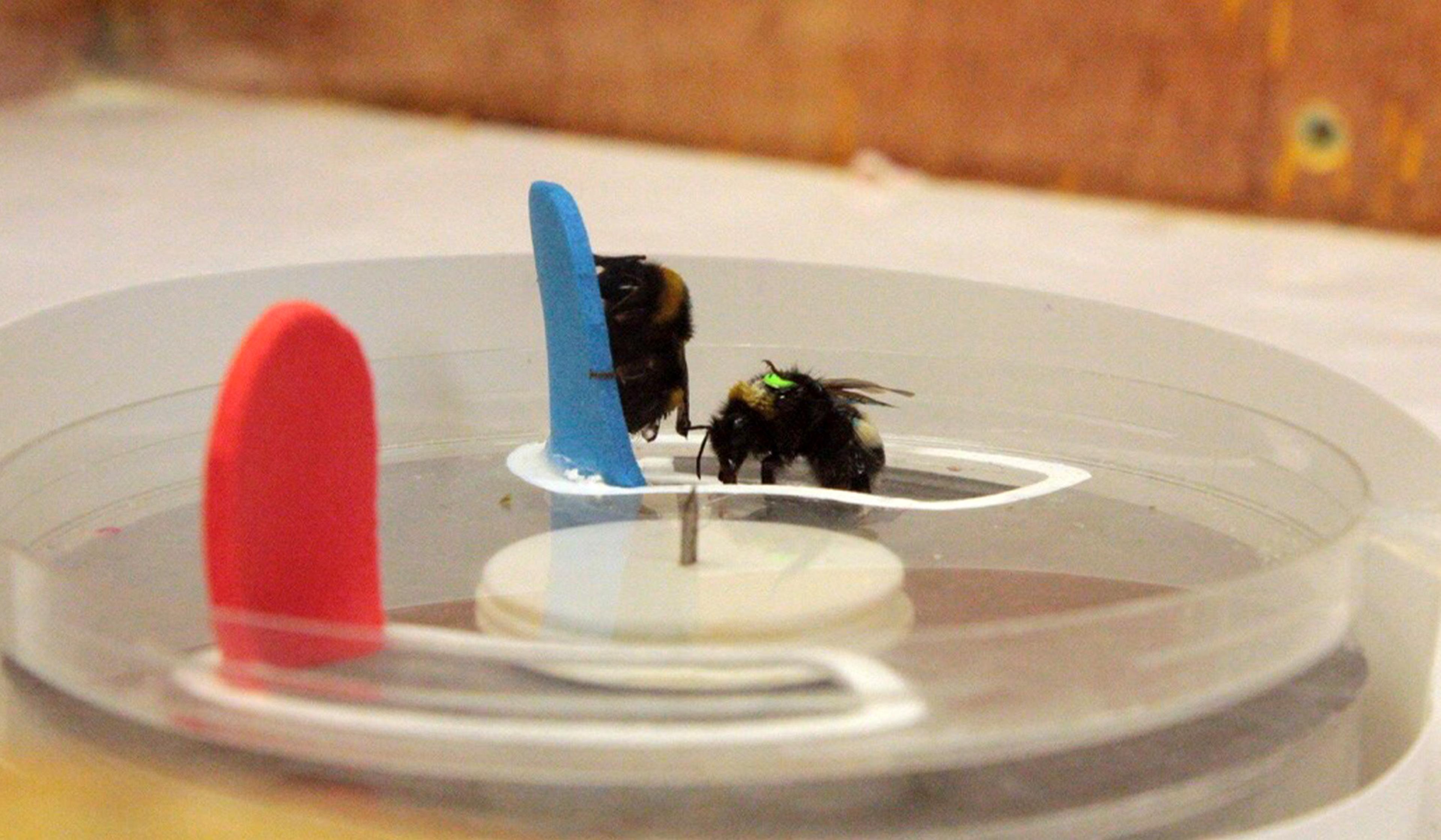
Cognition and intelligence
What’s this buzz about bees having culture? Inside a groundbreaking experiment
8 minutes