Social networks have changed radically during the past 10 years, and so have their offices. Second Life, which created a virtual world online, was one of the first social networks to thrive in the years after the 1999 dotcom crash, by allowing tech workers to escape mundane reality for elaborate fantasy. Facebook, the dominant social network of today, offers a different sort of escape. Instead of a fantasy realm, it offers users an idealised version of their own lives. And this contrast is reflected in the office design of the two eras, which moved from the nondescript industrial aesthetic of the early 2000s to the heavily stylised offices of 2014. Today’s tech office is designed not as a utilitarian workspace for its workers but as a personalised, curated space that expresses individual identity.
This elaborate, ongoing personalisation of the office is an artefact of the tech industry’s ambition to appear innovative. Take the 19th-century log cabins that were recently installed in the cafeteria of Twitter’s headquarters in San Francisco. The two cabins were carefully dismantled and moved from their original site in Montana, and they are meant to express a rejection of all things mass-produced. ‘It’s not something you can just buy out of a catalogue’ is how the designer Olle Lundberg explained the choice to SFGate, the website of the San Francisco Chronicle. Tech-company digs have gone from the spare offices of the post-1999 crash to increasingly bespoke spaces that are becoming emblems of a new gilded age – much like San Francisco’s expensive real estate or the infamous private buses ferrying employees of Google, Facebook and Apple (among others) from their homes in San Francisco to their offices in Silicon Valley.
While the off-hours activities of Wall Street workers are famously decadent, only recently did a particularly luxe corporate office become a perk of working for this particular successful sector of the economy. Even Eames and Aeron chairs – signal artefacts of office luxury – were originally utilitarian by design. The Aeron office chair was initially designed as comfort seating for the elderly, while the iconic Eames task chair, now often crafted for executive boardrooms in soft leather, was originally designed in mesh to withstand weather outdoors. In contrast to the many styles of midcentury home interiors, 20th-century office design created only a few classics: the 1930s B65 desk, designed by Marcel Breuer and made from tubular steel; and the 1964 Action Office 1 furniture set, designed by Bob Propst and George Nelson for Herman Miller as the world’s first open-plan office system, combining a desk with shelving, storage, and workspace dividers.
These classics ushered in the mass construction of the corporate office as a space of modular repetition, where identical workspaces can be positioned in a tight pattern on an open floor. By the 1960s, the model of the closely packed office space full of rectangles – from fluorescent light fixtures spaced at regular intervals to the desks similarly arranged below them – was standard. Status was symbolised not by the decor of the open-plan office floor but by the enhanced luxury of private offices, where executives could provide Mad Men-like hospitality with the help of leather sofas and fine whiskeys. But while that era’s ad executive might throw parties, and even sleep, in his office, desk pools were built for assembly-line efficiency. The 1970s and ’80s continued this trend, with the development of padded rectangular cubicles that focused workers on work. For the average employee, the 20th-century office was not meant to be a full-service, unique destination like the swank tech offices of today. Instead, it was designed to be a uniform environment that was as easy to set up and work in as it was refreshing to leave.
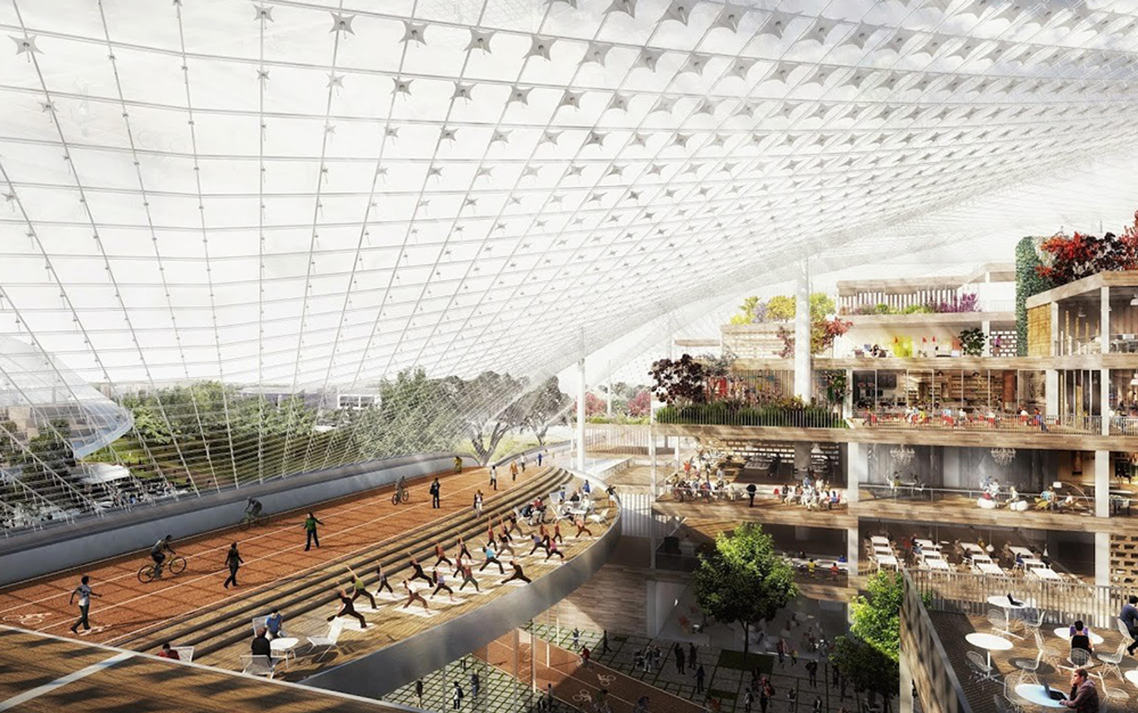
In the first decades of the 21st century, however, the corporate office has been quickly transformed from a predominantly functional space into a more ornate, individualistic environment, dedicated not so much to work as to promoting personality and social status. The tech industry has reimagined the office as a vehicle for conveying workers’ social and professional prestige. Indeed, the well-designed office has become as much an accessory to a high-end, high-tech lifestyle as a luxury car or a fashionable outfit.
In 2014, an invitation to a tech office is the industry’s version of an invitation to the home of a new friend or business partner. To be invited to the office symbolises trust and hospitality, a desire to share one’s culture and good fortune, so that when one enters the tech company as a visitor, one expects to be entertained, dined, and acculturated in the values and tastes of the company. Facebook, for example, handprints posters stating its company values and has inlaid its courtyard floor so that the tiles spell out ‘Hack’. Twitter frames art depicting iconic Twitter user content, such as the Oscars selfie posted by Ellen DeGeneres, which was shared more than 2 million times. Airbnb’s headquarters, also in San Francisco, has replicas of the website’s most stylish rented rooms built inside its office space, which make it into a home of sorts. Like today’s social networks, where work and social life are increasingly mixed, the workplace becomes not an exception to workers’ personal tastes, but another expression of it.
The trend towards office design as an expression of employee taste began after the dotcom crash, when tech companies auctioned off all of their Aeron chairs and ping pong tables, which had come to symbolise tech-office playfulness. As a result, tech offices of the early 2000s tended towards a more sober utility, meant to reassure investors of their restraint.
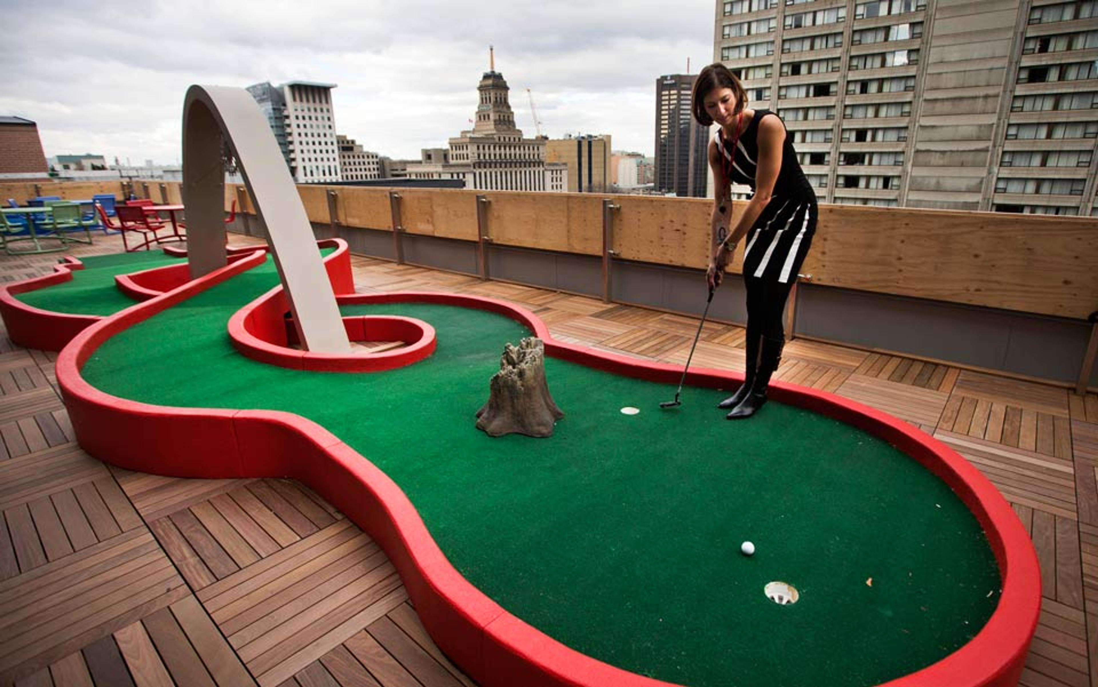
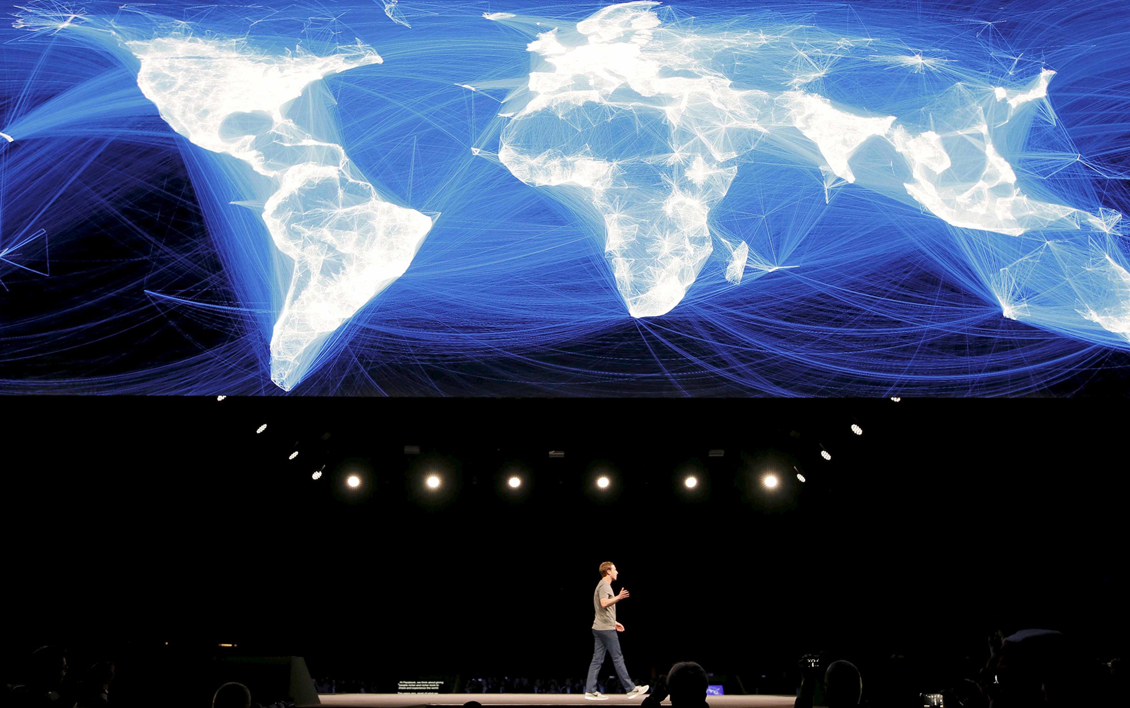
It took a new generation of companies to renew the playful tech aesthetic. In 2004, Mark Zuckerberg moved Facebook from his dorm room at Harvard University cross-country to its headquarters in Silicon Valley. The company’s first office on Emerson Avenue in Palo Alto recreated Zuckerberg’s dorm room in its design aesthetic, with a video game room replete with ratty couch and rattier blankets. Meanwhile Google’s headquarters in nearby Mountain View adopted a playful, more elementary-school feel with primary colours, exercise balls, and oversized robot sculptures. By 2007, the Day-Glo look – what one could call the ‘orange period’ – had taken over tech, transforming conferences, T‑shirts, and offices into seas of bright orange, yellow and lime green.
The economic crash of 2008 ushered in a new, almost military sobriety, best represented by Facebook’s renovation of an old Hewlett-Packard building in the Stanford Research Park in Palo Alto complete with cavernous, sterile rooms and cement floors. As the economy recovered over the next several years, a new idiosyncratic kind of luxury began to flourish, evident in the appearance of custom pieces, hand-hewn wooden trimmings, and the increasingly eclectic fixtures that mark today’s tech offices. This latest trend can be read as an attempt to disguise work – with trimmings that suggest personality in place of the smooth, ordered humming of a corporate workforce.
This is why the walls in Facebook’s latest headquarters in Menlo Park are covered in graffiti: it makes an office sited on suburban marshland seem like a buzzy urban street. Reassuringly for its well-off workers, however, it’s still a high-end kind of street where the graffiti is done by artists on commission rather than by some masked figure spray‑painting without permission.
What connects Facebook’s incongruous graffiti and Twitter’s incongruous log cabins is their expense. Both represent a complete renovation of the space, making graffiti and log cabins (not in themselves luxurious) seem like high-end amenities. The homesteader who originally lived in Twitter’s log cabin lived a much more rugged life than the office worker, and this contrast is part of the log cabin’s frisson in the office. Likewise the men’s clothing shops in fashionable areas of San Francisco such as Hayes Valley and the Mission that sell multiple styles of artisanal leather boots and allow the tech worker to model himself on a rugged 19th-century labourer. The rough-hewn, old-fashioned look of Twitter’s cabins is repeated in all the reclaimed wood that has crept into the high-tech workspace in recent years. Any splinters you get from these textures is a small price to pay for the tactile, pre-modern feeling of a place that is otherwise devoted to the collection of ethereal data. It is this very need to represent high-tech luxury at the same time as invoking its opposite that drives the modern baroque of early 21st-century tech offices.
the blurring of recreation and work becomes doubly disconcerting: is one headed out on vacation or still at the office – and is there a difference?
At Square, the smartphone payments company in San Francisco’s Central Market district, the cafeteria is a mix of space-age, Star Trek-like lighting elements and tree-stump accent tables. The effect might be spare, but the luxury of this office is that it can have it both ways – along with craft beer on tap and the original art on the walls, it looks like the home of a wealthy eccentric. The cafeteria’s vast, cement-floored space is another way of manifesting this iconoclastic luxury: the luxury of affording ample space, where one can decide not to put up anything at all.
Of course, the remaking of the contemporary tech office into a mixed work-cum-leisure space is not actually meant to promote leisure. Instead, the work/leisure mixing that takes place in the office mirrors what happens across digital, social and professional spaces. Work has seeped into our leisure hours, making the two tough to distinguish. And so, the white-collar work-life blend reaches its logical conclusion with the transformation of modern luxury spaces such as airport lounges into spaces that look much like the offices from which the technocrat has arrived. Perhaps to secure the business of the new moneyed tech class, the design of the new Centurion Lounge for American Express card members draws from the same design palette as today’s tech office: reclaimed-wood panels, tree-stump stools, copious couches and a cafeteria serving kale salad on bespoke ceramic plates. In these lounges, the blurring of recreation and work becomes doubly disconcerting for the tech employee. Is one headed out on vacation or still at the office – and is there a difference?
If the reward for participation in the highly lucrative tech economy is not increasing leisure but a kind of highly decorated, almost Disneyland vision of perpetual labour, what will be its endgame? As work continues to consume workers’ lives, tech offices might compete for increasingly unique and obscure toys and luxury perks to inhibit their employees’ awareness that they are always working. Once the rustic pioneer look has gone stale, one could imagine a turn to an even more ornate luxury aesthetic, heavy on materials such as gold and marble that evoke the wealthy tech class’s divergence from the 99 per cent. Or we might see a return to a vintage business aesthetic, a brushed-up version of a 1980s Hilton business hotel, refreshing and newly cool in its squareness.
Or maybe the office itself might become obsolete, if the work-from-home revolution ever takes off in earnest. One can imagine a trajectory where design stops trying to blur work and leisure, and instead works to strenuously demarcate the two for workers who have forgotten how to leave work behind. Maybe then the workspace of the future will come full circle, by transforming into a deluxe version of the Action Office cubicle. But instead of being a module on the office floor, it will be a module in a home, networked virtually and, except for its location, indistinguishable from all of the others. The utilitarian floor plan will have returned, only this time it will be atomised and dispersed across billions of homes spread across the planet.
