My mother was someone who made do in a world that didn’t fully account for her body. Born with bilateral clubfoot in 1940, she was not expected to walk. One of her earliest memories was of being carried by her father on to the bus, her plaster leg casts heavy from soaking in the bathtub the night before so that the doctor could remove them. After numerous childhood surgeries that rearranged the bones in her feet, my mother was able to walk, but everyone – including her – expected that she’d use a wheelchair by the time she was 30. Her toes were permanently curled under her feet, her heels didn’t touch the ground, and her calf muscles remained underdeveloped. She would never be spry, and shoes and socks would never fit quite right. I never saw her run.
But my mother didn’t use a wheelchair and, perhaps for that reason, never referred to herself as handicapped nor to her disability as a disability, not even late in her life when disability became more openly discussed. Instead, as disabled people have done throughout history, she navigated the designed world as best she could.
‘There is no design-free world,’ writes Iris Bohnet, a behavioural economist at Harvard, in her book What Works: Gender Equality by Design (2016). The material world in which individuals engage every day is shaped and reshaped through design – for better or worse. When entering a space, people have long been expected not only to compensate for but also to overcome their disabilities. But sometimes, no amount of ingenuity can overcome the mismatch between a given individual and a given space – and then, exclusion is the result.
During the Super Bowl this year, a commercial about inclusive, or human-centred, design was broadcast, showing how Microsoft redesigned the Xbox by working with children who have disabilities. The end result was accessible packaging, giant buttons instead of switches, and a controller that allows the gamer to use sipping and puffing breaths to play. For years, as a result of design decisions, kids with disabilities had been excluded from interacting with this game and, by extension, with other kids. That exclusion couldn’t change until designers faced the biases built into the conventions of their industry.
When Claudine Jaenichen, an information designer at Chapman University in California, looked at the materials provided to the public for use in managing an emergency, she found that most of these maps and visualisations were designed for climate experts and urban planners, and then distributed without any alterations. Jaenichen’s redesign project, called TsunamiClear, included a four-year cognitive-recall study to demonstrate that the redesigned maps were not only better understood but also better remembered by more people.
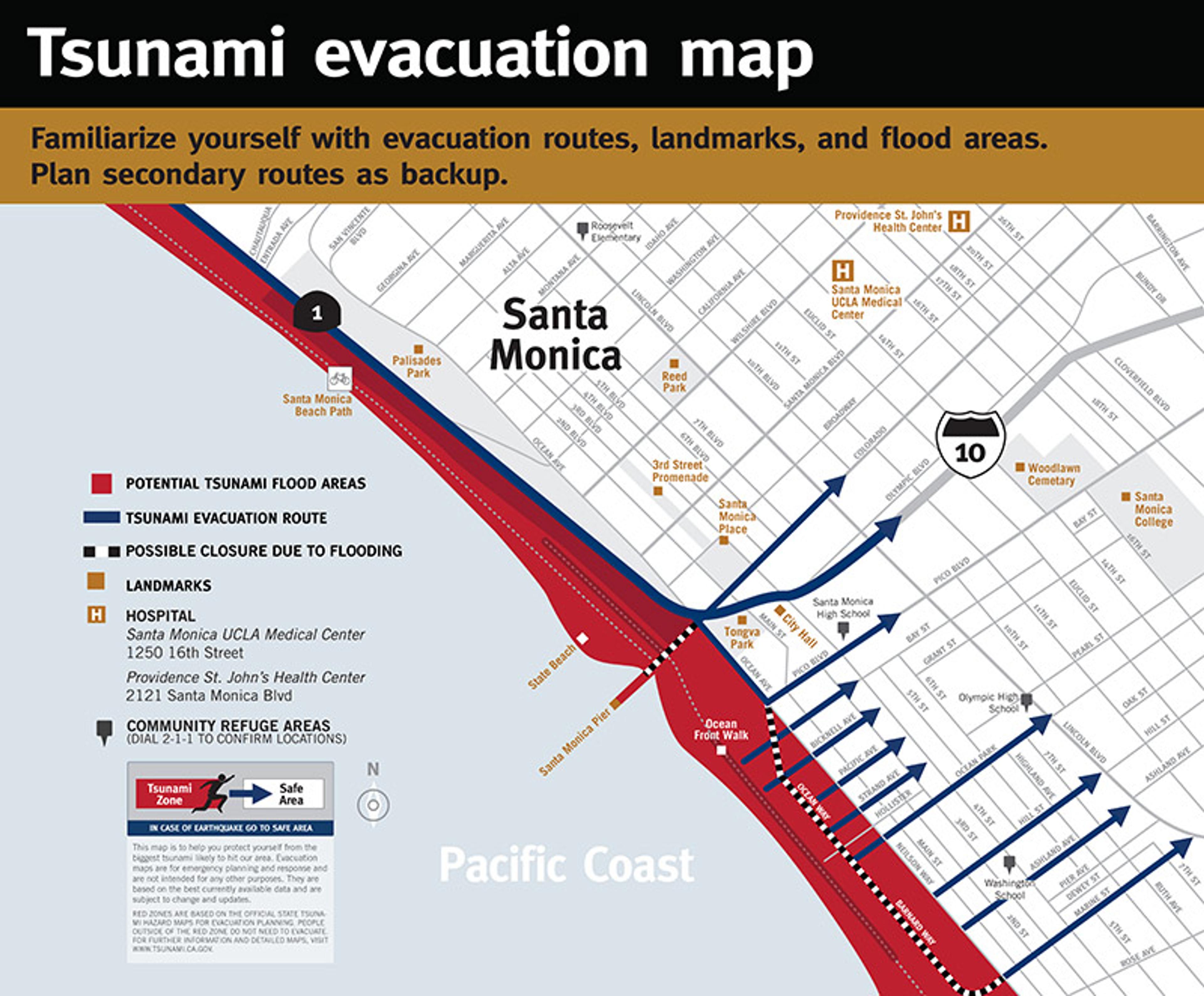
Courtesy TsunamiClear/jaenichendesign.com
The designers of Microsoft and TsunamiClear allowed themselves to face biases that had influenced earlier design decisions, and to rethink the design possibilities with input from those who had been excluded – many of them not disabled. ‘The objects and people around us influence our ability to participate,’ writes Kat Holmes, director of inclusive design at Google, in her book Mismatch: How Inclusion Shapes Design (2018). To alter the form of a building or the layout of a room, the shape or size of a tool, the way a text is read, or the structure of an organisation or a standardised process, is to alter how people will interact with these surroundings and each other.
This idea that the world should be accessible by design represents a rethinking of modern society and culture. In the 19th century, the Industrial Revolution gave way to national and international standardisation, from electrical power systems to time zones. In the wake of the transition from fabrication of goods by hand to manufacture of goods by machines, uniformity benefitted production, trade and the bottom line.
Take shoes and socks: prior to industrialised standards, they were handcrafted by an individual for another individual. A cobbler could make adjustments if one’s left leg were shorter than one’s right, or for the bunion a previous shoe had caused. Then in the 19th century, shoe production shifted to large-scale manufacturing. Today, while a given model might come in different lengths, many manufacturers produce shoes in a standard width, and don’t account for other limb variations. Shoes are tailored not to individuals but to activity. The American basketball player Chuck Taylor developed a sport shoe a hundred years ago for Converse that’s become a lasting fashion trend. Boots with protective steel tips are required by some employers to comply with occupational health and safety regulations, and manufacturers have only recently produced them with women in mind too, as cultural ideas of women’s work change.
Socks are even less tailored to the individual than shoes. In her book Sock (2017), the American author Kim Adrian puts the total number made each year at 81 billion individual socks. That’s more than five pairs produced every year for each person in the world. It’s unfathomable to comprehend fabricating that many socks with our differences in mind. But mass production tends to make goods more affordable for the producer and for the consumer and, therefore, more accessible across socio-economic classes. It also allows for quality control, so when you buy a pair of socks, you know exactly what you’re getting, even if they aren’t exactly the size and shape of the feet you put into them.
The visible mismatches of disabled veterans offered an opportunity to design the world with accessibility in mind
Traditionally, what people get through mass production is something designed for an abstraction of an ideal male body. ‘In cars, radios, furniture, telephones, and other gadgets of the automated and electrified 20th century, small details of design echoed the assumptions that users of technology were generally spry, and male by default,’ writes Bess Williamson of the Art Institute of Chicago in her book Accessible America: A History of Disability and Design (2019). For example, the US National Highway Traffic Safety Administration began using a female crash-test dummy for safety compliance testing only in 2003, even though women are at greater risk of injury or death than men in automobile collisions. Customarily, those whose bodies did not fit the standard, who were not spry or male, had to make do. Designers didn’t account for variations of the human body.
Yet in order to design a more accessible human world, the mismatches must be recognised. Second World War veterans and survivors of the 1950s polio epidemic made such physical mismatches newly visible in the United States. With this recognition, accessibility became a shared concern at national and local levels. Over the next few decades, the expectation that everyone would adapt themselves to the designed world was challenged. The visible physical mismatches of disabled veterans and polio survivors made exclusion more visible, and offered an opportunity to design the world differently, with accessibility in mind.
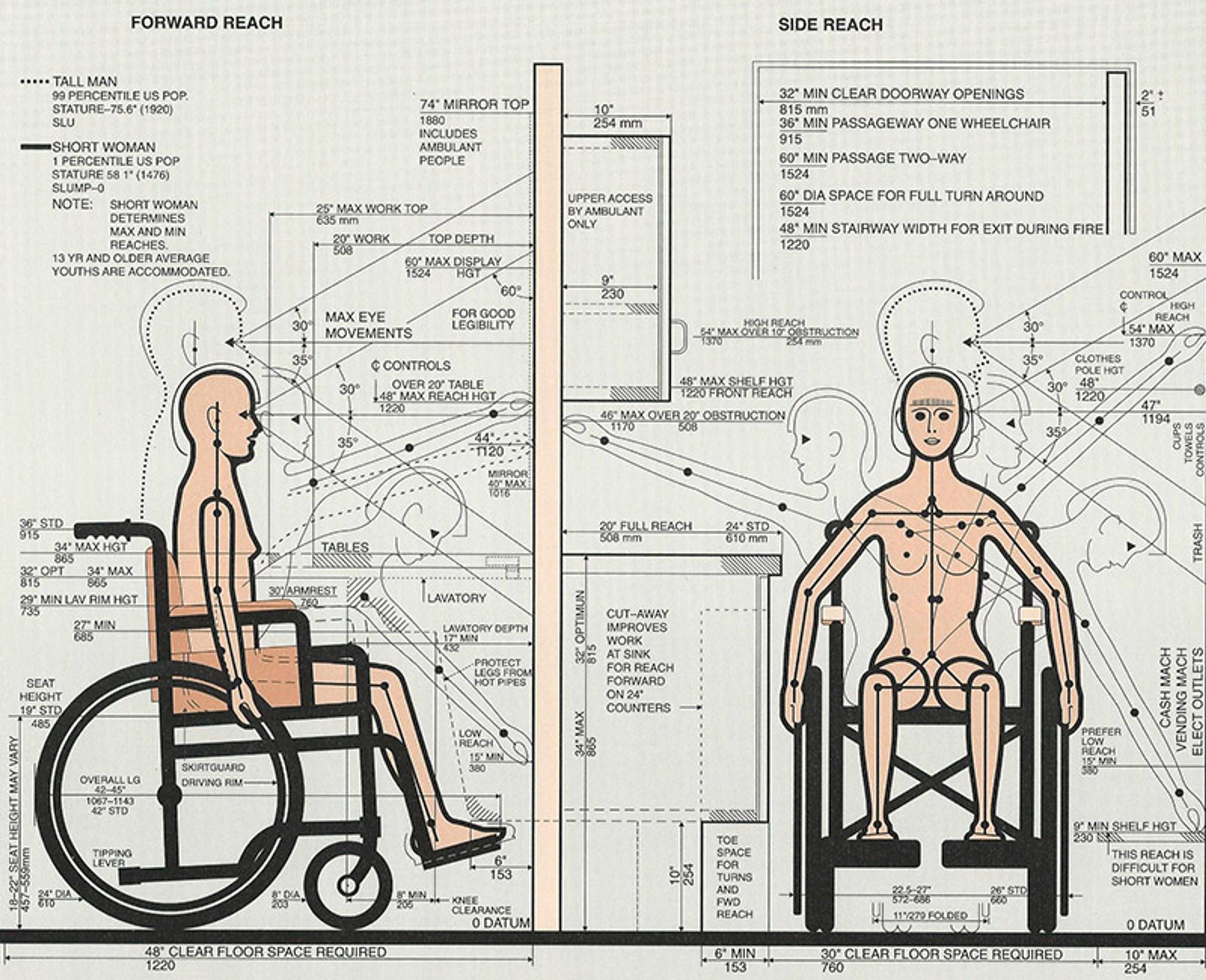
Reach Factors for the Differently Abled. Image from Henry Dreyfuss Associates’ The Measure of Man and Woman (Updated 2002) Courtesy John Wiley and Sons Inc.
At that time, the work of the American industrial designer Henry Dreyfuss included altering the weight distribution of prosthetic limbs based on observation of those who actually used the devices. He took a scientific approach to ergonomics, using statistics to show how standard, adjustable designs could work for the majority of human bodies. In his book Designing for People (1955), Dreyfuss constructed charts that accounted for 95 per cent of male and female bodies – he called them Joe and Josephine – so that a single design could accommodate a small, medium-sized or large adult. As he expanded his efforts, he argued that tools – an iron or a vacuum – should be understood by the designer as an appendage of the body itself. By 1974, an issue of Industrial Design went even further to suggest that no individual is really normal, and the American furniture designer Niels Diffrient updated Dreyfuss’s work to include data on the elderly and people with physical disabilities. Dreyfuss’s The Measure of Man (1959) was updated most recently in 2001 to include digital workplaces.
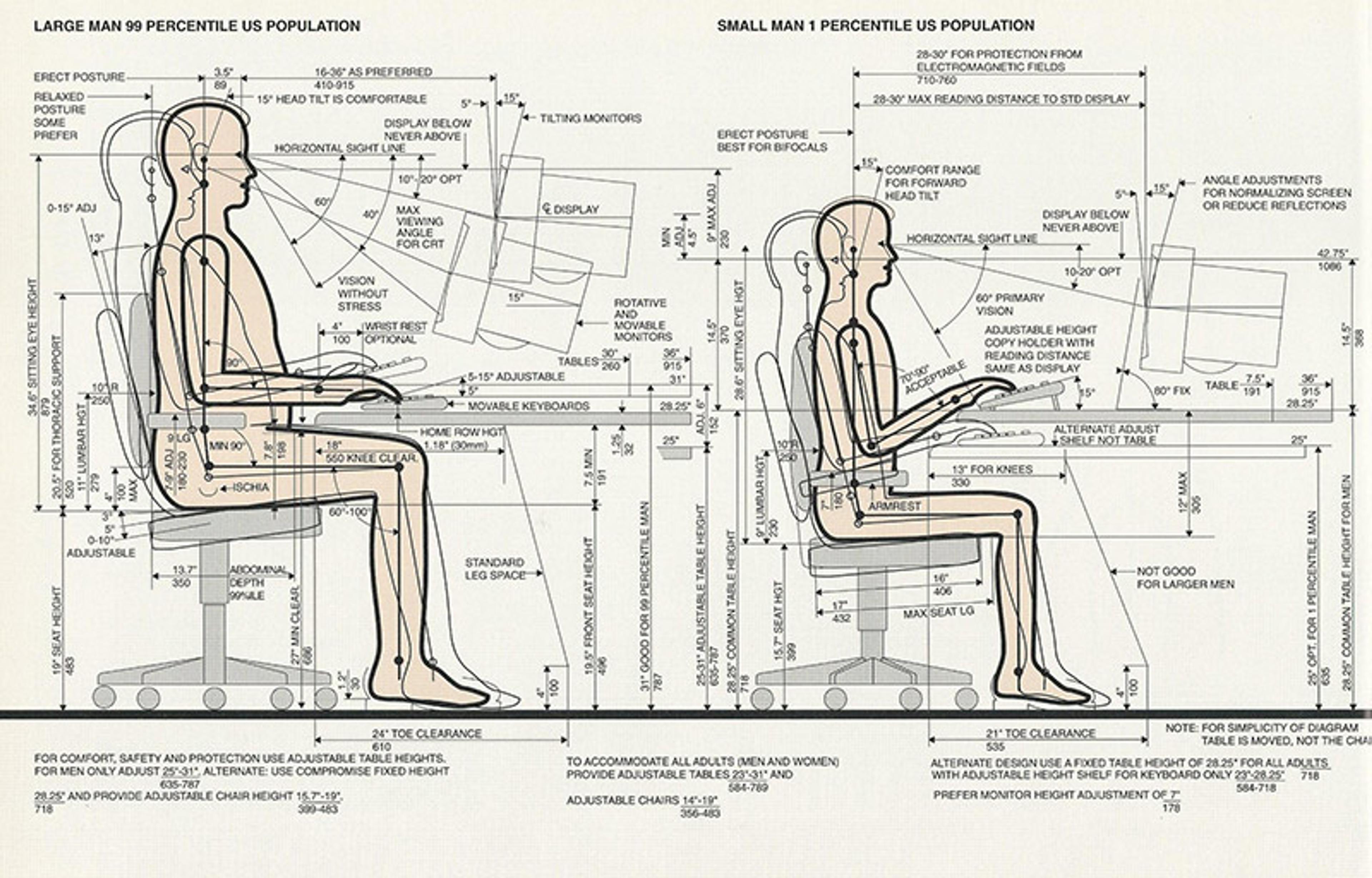
Computer work stations. Image from Henry Dreyfus Associates’ The Measure of Man and Woman. (Updated 2002) Courtesy John Wiley and Sons Inc.
As designers were reconsidering how to plan for actual human bodies, laws were changing too. The US Rehabilitation Act of 1973 extended civil rights to people with disabilities and required that federal information technology be accessible. Within a few years of that, Telegraph Avenue in Berkeley had been renovated with wider sidewalks and 16 wheelchair ramps. At the University of California, Berkeley, wheelchair-using students formed a community known as the Rolling Quads and secured federal funding for the Physically Disabled Students’ Program, which provided resources and advocacy. By 1990, the US adopted the Americans with Disabilities Act (ADA), and designers of public spaces became accountable for accessibility in ways they never had before.
While definitions of disability vary, according to the US Department of Justice: ‘An individual with a disability is defined by the ADA as a person who has a physical or mental impairment that substantially limits one or more major life activities, a person who has a history or record of such an impairment, or a person who is perceived by others as having such an impairment.’ In 2010, almost one in five people in the US had a disability, with more than half of those reporting that the disability was severe, according to the Census Bureau.
My mother – a civil rights advocate and practising attorney most of her adult life – did not consider her major life activities substantially limited, though her access was sometimes inhibited, and others sometimes perceived her legs and feet as an impairment. She took her physical condition and the material world around her as givens, as things she couldn’t change.
Yet over the years, laws such as the ADA have shifted the responsibility of access from individuals to institutions and environments, paving the way for more inclusive design. Increasingly, our laws acknowledge that the material world can and should change to allow access by the variety of people in it. However, the American architect Ronald Mace, who used a wheelchair himself and had long advocated for accessible design, was, according to Williamson’s Accessible America, appalled ‘to see buildings where architects and engineers tacked on access features only when they realised the need to comply with government regulations’. Even in the wake of the ADA, accessibility of public spaces seemed an afterthought and an added cost, instead of part of basic design criteria that fostered aesthetics, functional innovation and inclusion all at once.
Implementation of the ADA might be considered a renegotiation of wayfinding, or what the Danish communication designer Per Mollerup in his book Wayshowing>Wayfinding: Basic & Interactive (2013) defines as ‘what we do when finding our way in unknown quarters’. When discussing design and inclusion, I suggest this definition be expanded to encompass unwelcoming as well as unknown spaces. Before the ADA, moving through public spaces demanded significant wayfinding skills of the individual, and burdened some far more than others. Sometimes, the mismatch between a physical space and an individual’s wayfinding ability meant that access was impossible. People made do as they rode the city bus to the doctor’s office, for instance, perhaps with the assistance of family or neighbours – or they didn’t go where they wanted or needed to go.
The ADA moved some of the responsibility away from the individual, thereby shifting the balance from wayfinding toward wayshowing. Mollerup defines wayshowing as ‘the professional activity of planning and implementing orientation systems in buildings or outdoor areas’. I suggest this concept be extended to digital spaces and organisational structures too. Effective wayshowing is the designer’s responsibility. It takes into account the wayfinding behaviours of people using the space, and it supports their interactions there. The yellow stripe at a train platform’s edge or the restroom sign featuring an abstraction of a human figure are forms of wayshowing that use widely understood symbols as cues for behaviour. Colour, brightness, reflectance, contrast and resistance to fading become crucial elements in signage as designers consider people with visual impairments who will navigate a space.
The ADA, then, asks designers to implement a version of wayshowing that creates fairness, regardless of physical or mental disability. The initial responses to the new law attempted to address shortcomings and solve problems that people with disabilities encountered in existing spaces. That meant, for instance, adding ramps to building entrances, widening doorways and stalls in public restrooms, and constructing curb cuts at street intersections to comply with the law. The ADA continues to ask designers – and those who oversee designed spaces – to remake the human world in ways that directly address the exclusion of those with disabilities to achieve greater accessibility and fuller interactions by more individuals, despite our assumptions and biases. In a sense, the ADA asks that bias not be built into the design of physical and digital spaces because the result is exclusion.
As marvellous as universal design can be in practice, it addresses disability by hiding it
It was in 1985, several years before the ADA went into effect, that Mace introduced the term ‘universal design’. Instead of addressing shortcomings with add-ons, universal design focuses on what works for everyone, where ‘everyone’ is a basic criterion, and the emphasis is on commonality rather than on difference. A classic example of early universal design is OXO Good Grips: 14 of these innovative kitchen implements hit the shelves just as the ADA was coming into being. OXO’s founder invented the easy-to-grip handles because his wife had arthritis. He redesigned a vegetable peeler to make a specific task easier for a specific person, but it also turned out to be a better design for people who didn’t have joint disease. Addressing the mismatch his wife had with her kitchen revealed a mismatch that the rest of us didn’t even realise we had, which was terrific for the company’s bottom line. This type of universal design makes inclusion look easy and profitable.
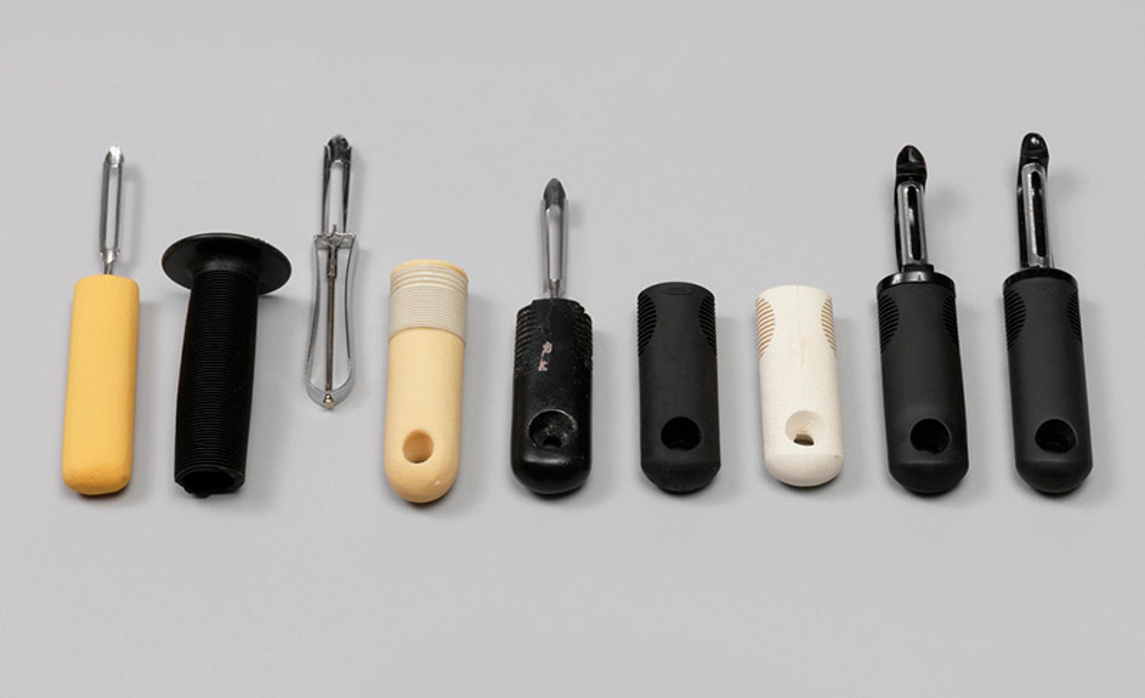
OXO Good Grips prototype for a peeler. Designed by Davin Stowell and Daniel Formosa, USA1990. Courtesy Cooper Hewitt Design Museum.
But this product’s attention to disability was what Williamson in Accessible America calls ‘a silent contributor’. Commercially, universal design was promoted as aesthetically appealing and functional, and marketing it that way fuelled sales. The focus was on the ‘everyone’ of universal design, which exuded a feel-good quality that promised to bring people together instead of singling out anyone. The fact that such successful products addressed disability appeared as a nice side effect, rather than inherent in the process or goals. As marvellous as universal design ultimately pledges to be, and can be in practice, it addresses disability by hiding it.
Because a person experiences a tool or a space, whether physical or digital, via the senses, and because one’s senses are unique, the curators Ellen Lupton and Andrea Lipps advocate something they call sensory design. This is a version of universal design that fosters inclusion based on acknowledgment of all five human senses as our means of access to the material world. In their book The Senses: Design Beyond Vision (2018), they write: ‘Sensory design supports everyone’s opportunity to receive information, explore the world, and experience joy, wonder, and social connections, regardless of our sensory abilities.’ They apply their sensory approach to the seven universal design principles established in 1997 by the Center for Universal Design at North Carolina State University: equitable use, flexibility in use, simple and intuitive use, perceptible information, tolerance for error, low physical effort, and size and space for approach and use.
Importantly, Lupton and Lipps focus not only on the isolated individual’s experience with the physical space but also on ‘social inclusion’ that allows ‘us all to interact and enjoy the offerings of an institution together’. Instead of responding to an individual access problem, Lupton and Lipps assert: ‘By addressing multiple senses, designers support the diversity of the human condition.’ Sensory design, then, attempts to blend universal design with acknowledgment of individuality so that, for instance, a mismatch between a visual cue and a person with a visual impairment doesn’t prevent access. In taking into account all five senses, designing for everyone comes closer to designing for (the variety of) individuals too, because multisense wayshowing, to adapt Mollerup’s term, accounts for a variety of sensory abilities and habits.
Of course, the human-designed world is complicated, involving physical, digital and social spaces, and our assumptions and biases can be difficult to uncover. Disability might not be physical, and even physical disabilities might seem invisible. Immune system disorders, chronic pain, vestibular system damage, mental illness and learning disabilities, for instance, might not be easily discerned by others in public spaces or the workplace. Roughly 33 million American adults, most of them of working age, have a temporary or permanent problem with dizziness or balance, according to the National Institute on Deafness and Other Communication Disorders. Someone with a vestibular disorder might need to avoid rotating ceiling fans or use transportation assistance. Four in a hundred of us have a mental, behavioural or emotional disorder that limits major life activities: someone with an anxiety disorder might need a quiet office space. A definition that encompasses a hidden disability such as mental illness is relatively new, and expands the concept of inclusive design of physical or digital spaces and of societal structures.
In her article ‘Even If You Can’t See It: Invisible Disability and Neurodiversity’ (2019), Sejal Shah describes the mismatches she encountered at a college where she taught. At the time, she hadn’t been fully aware of ADA protections; and bipolar disorder, her disability, wasn’t protected under the ADA at the time. So Shah compensated for her largely invisible mental-health disability on her own: ‘ I didn’t know how to do anything other than perform wellness – although I knew I was having a harder time at work than my friends and colleagues.’ Now, hidden disability like bipolar disorder is one among many considerations when envisioning more inclusive design.
Inclusive design might be extended also to mismatches beyond disability. Shah writes of the mismatch between her ‘brown body’ and the largely white faculty community: ‘I had been marked “diverse” and therefore “requested” to serve on a diversity council – essentially another committee (I didn’t think pretenure faculty could afford to say no).’ Responsibility for ensuring a community’s diversity – of gender, sexual orientation, race, class or age, in addition to disability – sometimes falls to those who’ve traditionally been excluded through bias and design. Those most knowledgeable about mismatches might be expected either to solve the organisation’s mismatch problems (because mismatches are perceived to be their problem rather than systemic), or be excluded from design decision making altogether.
Shah points out that her supervisor, who didn’t provide much mentoring, used student evaluations – designed forms in which students, rather than supervisors or colleagues, assess performance – to build a case against renewing her contract. Numerous studies have shown gender and race bias in student evaluations. The sociologist Victor Ray at the University of Tennessee argues: ‘Using biased evaluations allows colleges and universities to punish those whose identities deviate from white male normativity.’ Given longstanding evidence of bias in such evaluation forms and processes, Ray asserts that weighting them heavily in judgments of employee performance purposefully maintains the status quo and makes clear who isn’t really welcome in that career.
He worried that she would fall down the stairs, perhaps a reference to her clubbed feet as well as the pregnancy
What if employers analysed the design of performance-evaluation processes and forms with inclusion as a criterion? What if they viewed work schedules and job tasks as the designed structures that they are? What if on-the-job mentoring were designed as something akin to equitable career wayshowing? ‘When I vented about my schedule and having to be on campus every day,’ Shah writes, ‘a tenured colleague and friend (white) mentioned she did not serve on committees that met on Fridays – she told people it was her research day. I had no idea one could say no for such a reason.’ Shah’s disability, gender and race created mismatches that not all people in that university space or role experienced. Some were more welcome than others, and she made do until she felt forced to leave. Each individual finds a way through – or finds mismatches with – the workplace.
In her career, my mother didn’t often acknowledge mismatches between her body and the physical spaces she moved through. Yet she found that her gender presented a significant mismatch in the classrooms and courtrooms of her profession. In fact, when she became pregnant with me, the dean of the law school required that she sit out for a semester, even though she had mapped out a plan to stay on track for graduation and the once-a-year bar exam. The dean couched his concern as one for her physical safety. He worried that she would fall down the stairs, perhaps a reference to her clubbed feet as well as the pregnancy. He made it clear that the few women in the programme were taking spots that men deserved, but his reasoning for excluding my mother while pregnant referred to the physical space in which she was not welcome. The material and societal environments are designed and inhabited in tandem.
My mother saw this sort of mismatch in the lives and careers of other women, too. That’s why she spearheaded the equal rights clause of the Illinois Constitution in 1970. She believed that the justice system offered ways to increase access.
Inclusion, after all, is a version of justice. The design of a physical space indicates both who is welcome and what behaviours are expected there. In What Works, Bohnet points to one study showing that just changing decorations in a computer science classroom can strengthen female students’ attitude toward careers in computer science. Other studies show that just seeing a picture of a strong female role model can undermine gender stereotypes, leading to stronger performance by women. In other words, the workplace can be designed with career wayshowing in mind.
Design is fundamental to more inclusive societal structures because it establishes – and can revise – deeply embedded and often unspoken cultural and cognitive defaults. It’s important to acknowledge, however, that while universal design and inclusive design can overlap, they are not the same thing. In Mismatch, Holmes echoes Lupton and Lipps when she writes:
The principles of universal design are focused on attributes of the end result, such as ‘simple intuitive use’ and ‘perceptible information’. In contrast, inclusive design was born out of digital technologies of the 1970s and ’80s, like captioning for people who are deaf and audio recorded books for blind communities.
Access is central to inclusive design; aesthetics and diversity – beauty and the ‘everyone’ – are not. ‘An inclusive designer is someone, arguably anyone,’ Holmes writes, ‘who recognises and remedies mismatched interactions between people and their world.’
The emphasis shifts from designing for people to designing with people
In addition, it’s important to acknowledge that there exists no truly universal design that works equally well for all individuals. Interactions with physical and digital environments differ depending on who’s navigating them. In his book Wayfinding Behavior: Cognitive Mapping and Other Spatial Processes (1999), the Australian-born geographer Reginald Golledge acknowledged a related shortcoming of universal design: ‘perfect knowledge of a complex environment cannot be achieved, because real-world environments … change over time’.
Every physical or digital space and every societal structure is a work in progress. In the words of Lupton and Lipps: ‘Inclusion is a state of thinking and acting toward a shared purpose based on a commitment to iteration, refinement, and self-improvement.’
In that sense, inclusive design must incorporate ‘the participation of excluded communities’ in the design process itself; the excluded are the experts on mismatches. With this broader understanding of expertise, the emphasis shifts from designing for people to designing with people so that each of us can make our ways, individually and collectively, through the material world.
When I think of navigating the world, I think of maps. The foldout road map of my childhood vacations, the map app on my cellphone, the tsunami evacuation map on the California street corner – maps embody wayshowing. Here’s where you are, and here’s where you can go. ‘Every map tells a story,’ writes the English historian Simon Garfield in On the Map: a Mind-Expanding Exploration of the Way the World Looks (2012). Maps tell stories of discovery and of empire, of voter turnout and of epidemiology, of where people have been and of what they do there – they suggest what’s possible for whom.
Like maps, designs are abstractions that tell stories. Who is here, and who is not? Who gets where they’re going, and how much time and effort does it take? A design is an idea, and the real-world implementation of that design – the ways people interact in the material world – is the story. We have the ability to change the story about humanity by changing the design of our physical, digital and societal environments. Through design that forces us to face and actively grapple with assumptions and biases, the human world can be made more accessible, more inclusive and more humane.