Culture spreads through people, but how does that really happen? This data visualisation from Nature Video charts the movement of 120,000 prominent cultural figures – predominantly European and North American – between 600 BC and 2012 CE, by plotting lines between where each one was born and died. While limited by its Eurocentrism – reflecting history as written by the victors – the visualisation proves to be an interesting tool for reimagining history.
What can a map of notable births and deaths reveal about the spread of culture?
Video by Nature
10 September 2015
videoInformation and communication
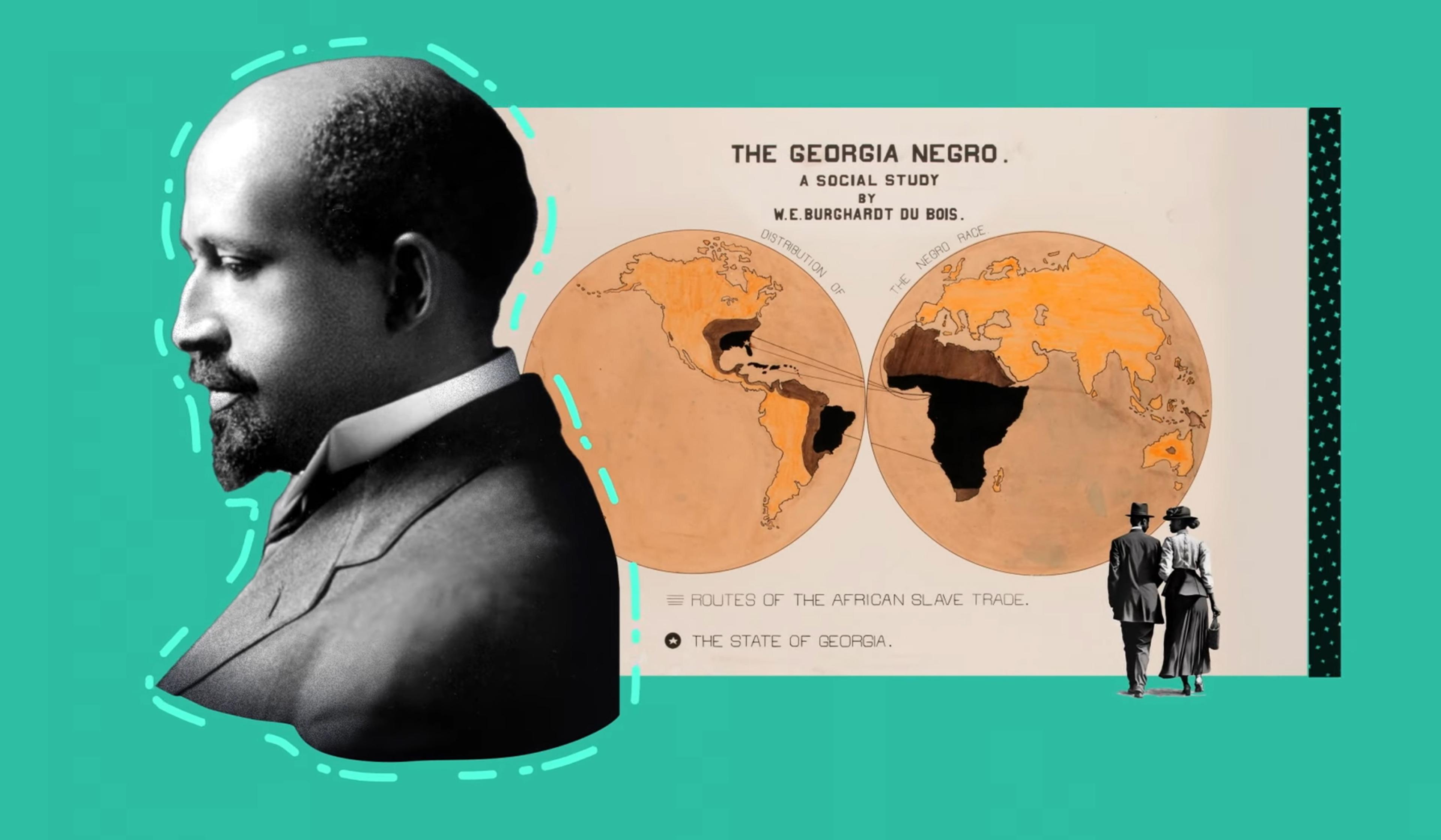
Mapping data visualisation’s meteoric rise from Victorian London to today
6 minutes
videoDemography and migration
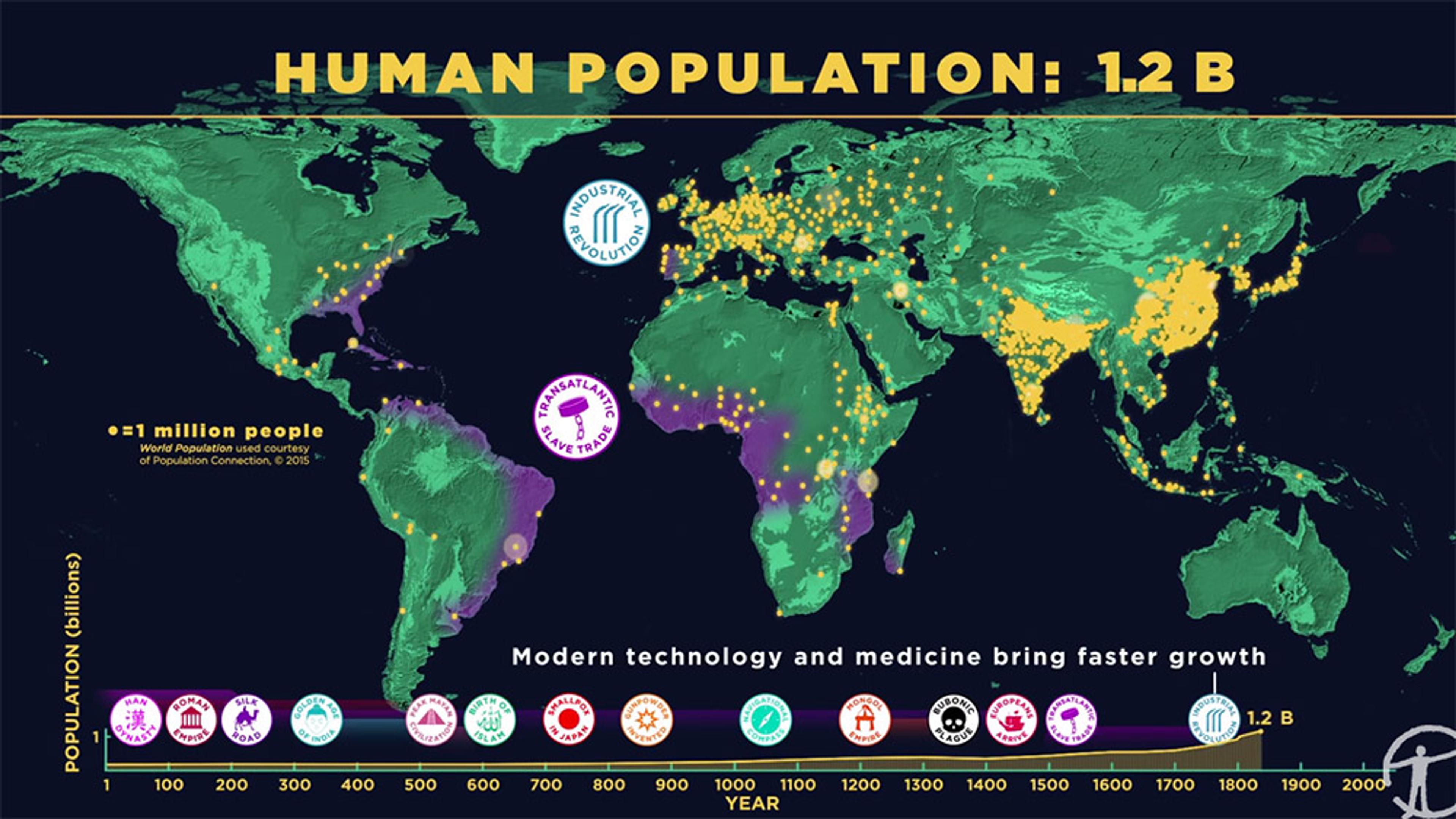
How we became more than 7 billion – humanity’s population explosion, visualised
6 minutes

videoDemography and migration
For a radical new perspective on immigration, picture the US as an ancient tree
6 minutes

videoHistory of science
Science doesn’t rely on luck, but success in science can’t do without it
5 minutes
videoHuman evolution
Could grandmotherly love help to explain how we became human?
3 minutes

videoHistory of science
Why data visualisation experts talk about truth, beauty, revelation and respect
8 minutes

videoLife stages
Ageing to the beat of their own drums – from one to 100 years old
3 minutes

videoDemography and migration
Is the ‘population bomb’ real? The statistician Hans Rosling says ‘Don’t panic’
59 minutes

videoTechnology and the self
Can you get to know someone through visualisations of their personal data?
3 minutes