One of the techniques for which Vincent van Gogh is celebrated is his evocative and striking use of colour contrast. In many of his most famous works – including Café Terrace at Night (1888), The Starry Night (1889) and Irises (1889) – his palette is soothing and inviting, yielding scenes destined to hang, for generations to come, on the walls of dorm rooms and doctors’ offices. However, this video essay from Evan Puschak (also known as the Nerdwriter) finds genius in the drab hues of Van Gogh’s somewhat lesser-known work The Night Café (1888) – a painting that was, by the artist’s own admission, ‘one of the ugliest I’ve done’. Probing Van Gogh’s personal letters and acute understanding of colour theory, Puschak examines how the painter deployed clashing, desolate greens and reds in the work ‘to express the terrible passions of humanity’.
Ugly on purpose: the intentionally drab desperation of Van Gogh’s ‘The Night Café’
Video by The Nerdwriter
videoArt
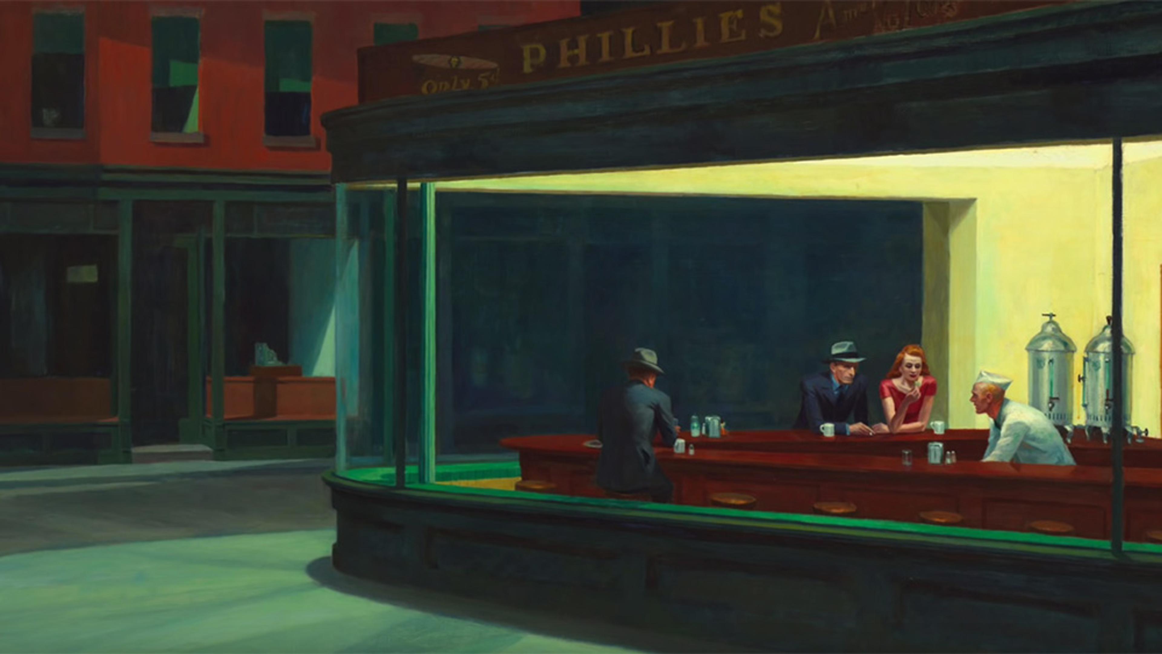
The flickering ray of hope in the stark loneliness of Edward Hopper’s Nighthawks
8 minutes
videoArt
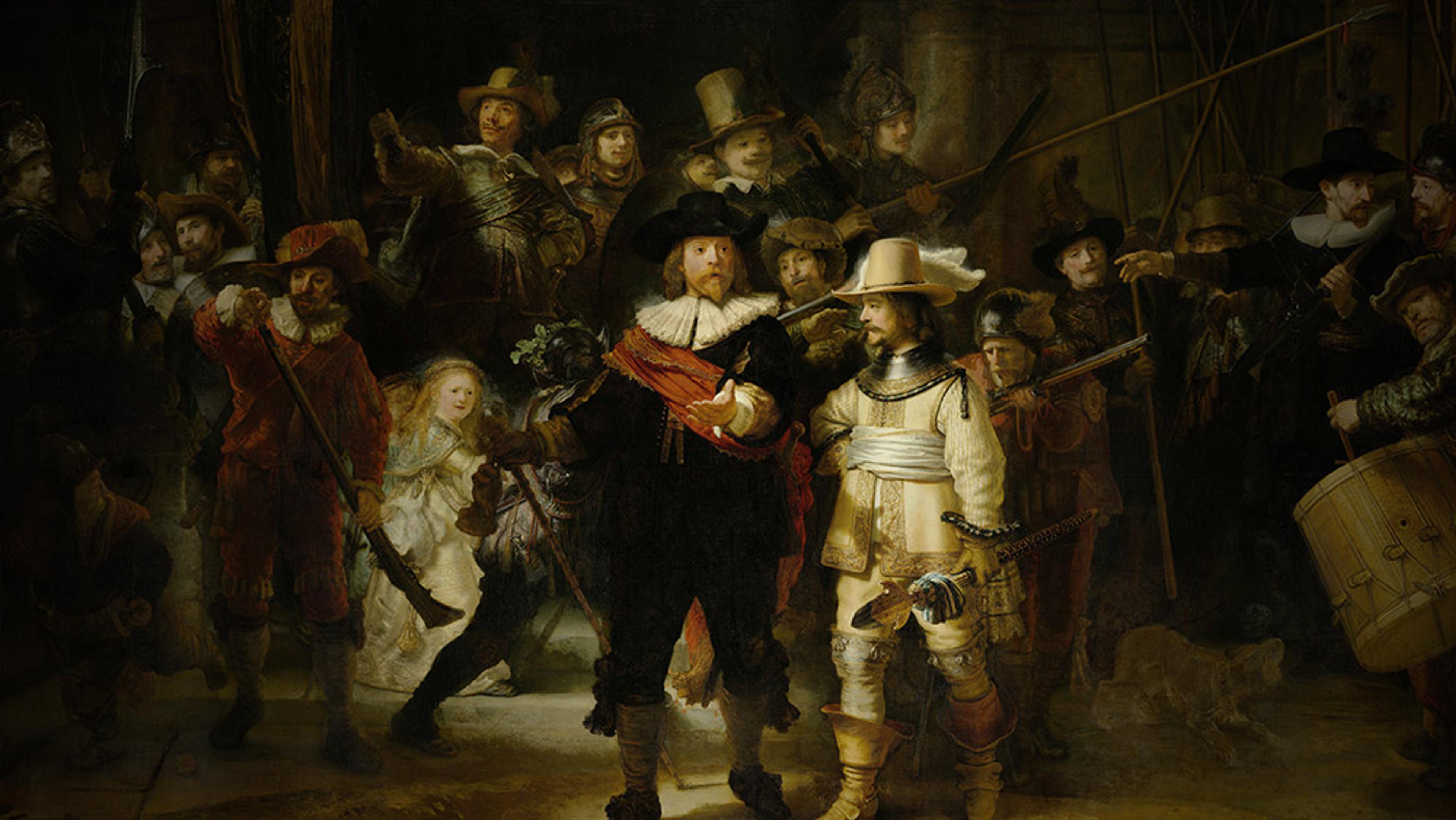
How Rembrandt used light and motion to make a mundane commission a masterpiece
8 minutes
videoArt
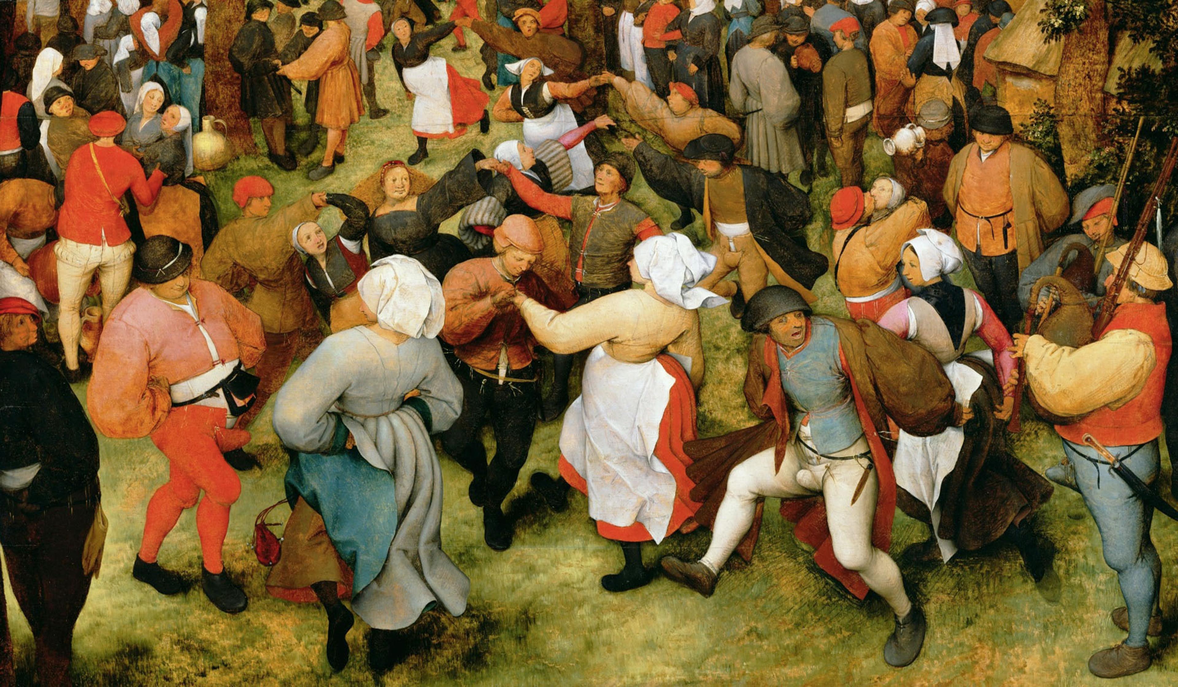
Why European artists shifted their focus from power to peasants in the 16th century
5 minutes
videoBeauty and aesthetics
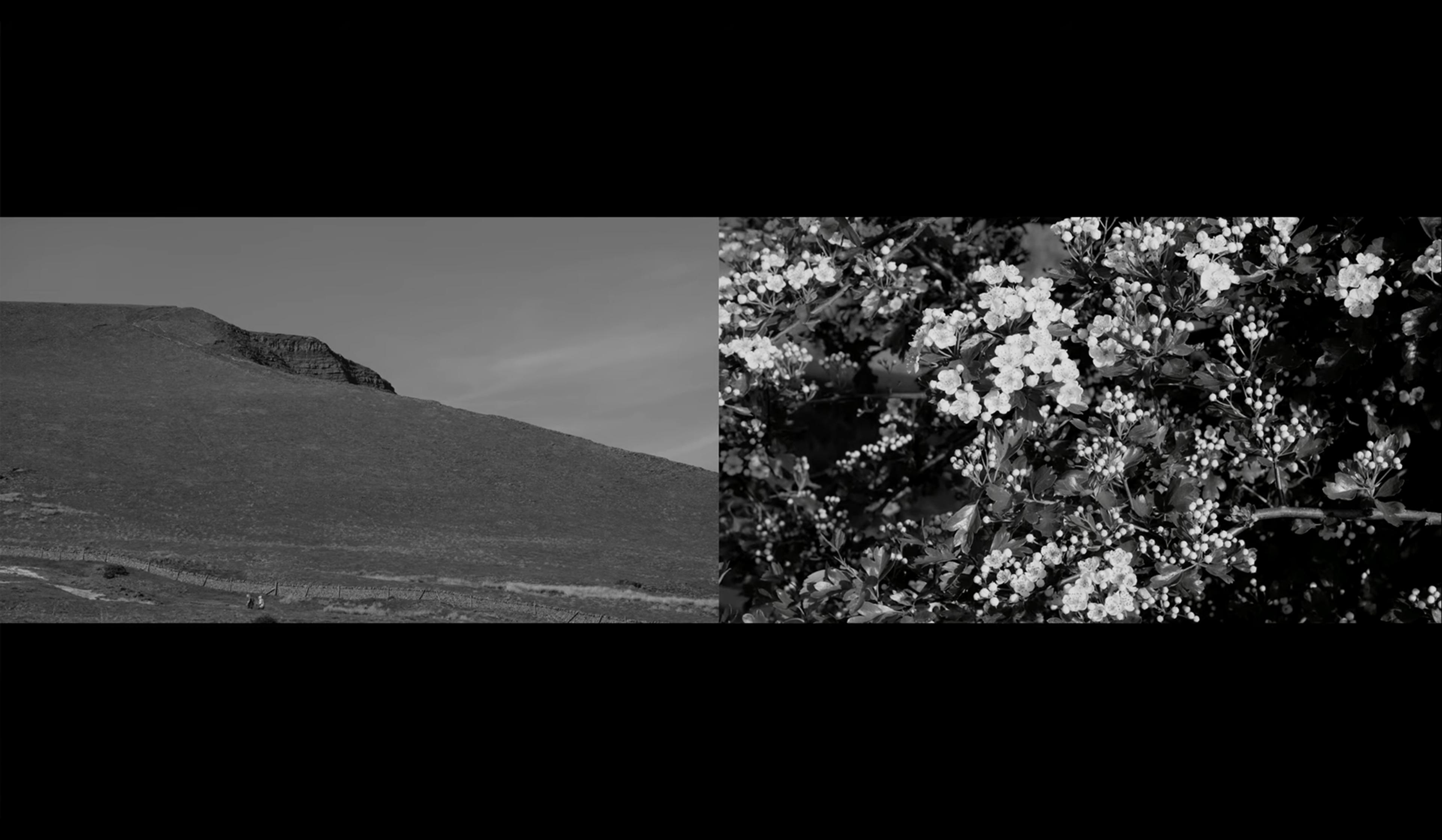
For Ruskin, words couldn’t capture nature’s palette. So here it is in black and white
6 minutes
videoArt
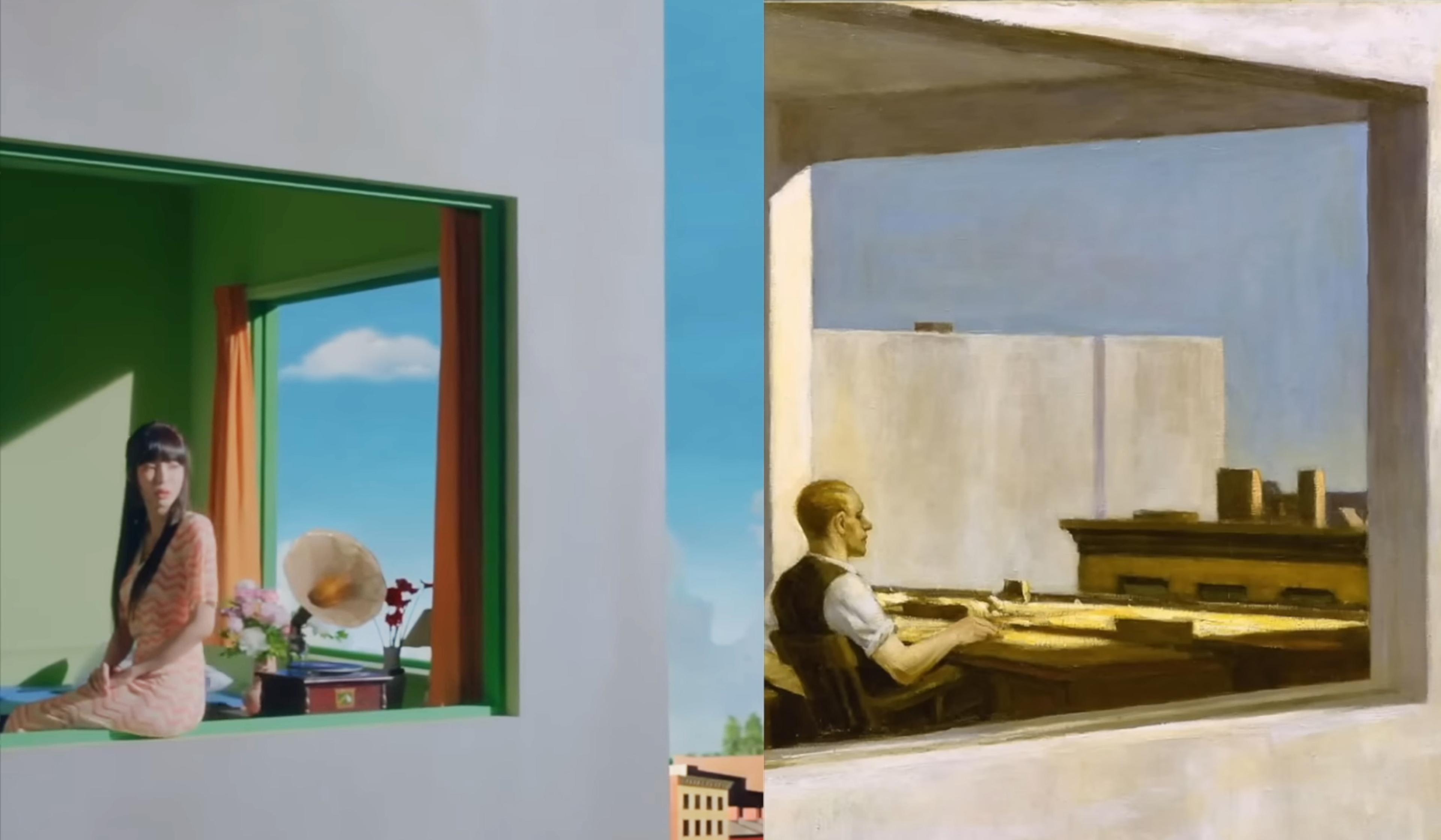
Edward Hopper came of age with cinema. As an artist, he left a lasting mark on it
12 minutes

videoArt
When is art a better tool for understanding mental illness than science?
8 minutes

videoHistory of science
Insect aesthetics – long viewed as pests, in the 16th century bugs became beautiful
8 minutes
videoBeauty and aesthetics
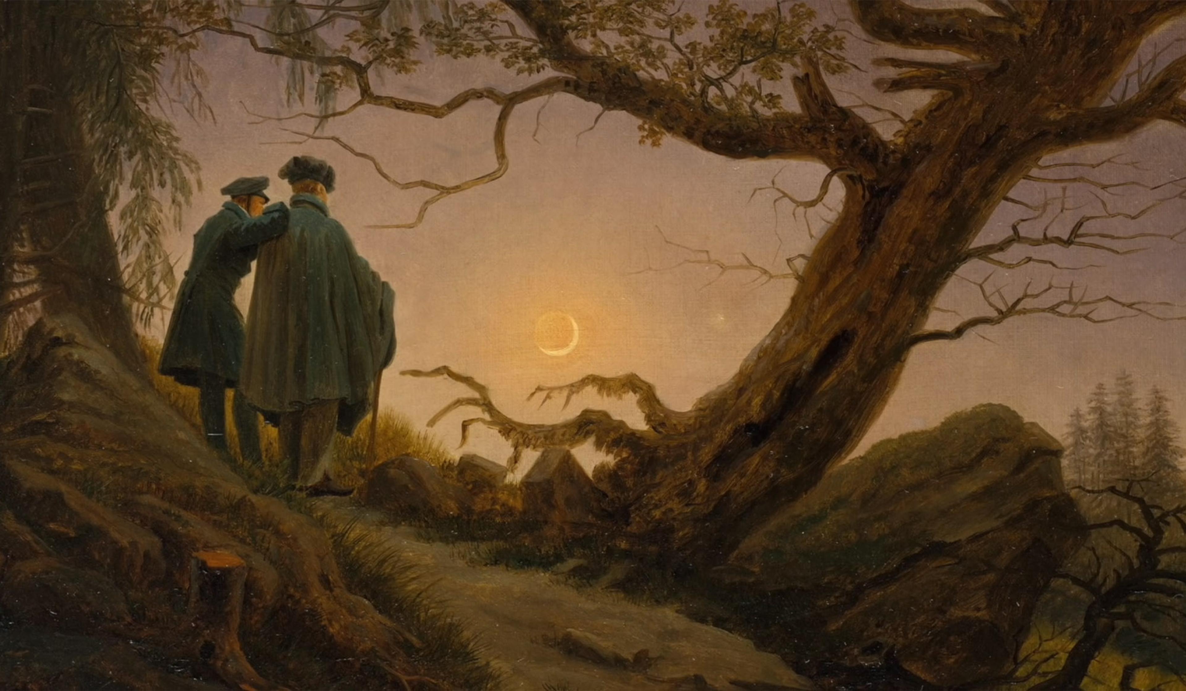
Why Caspar David Friedrich pits nature’s grandeur against the humble human
7 minutes
videoArt
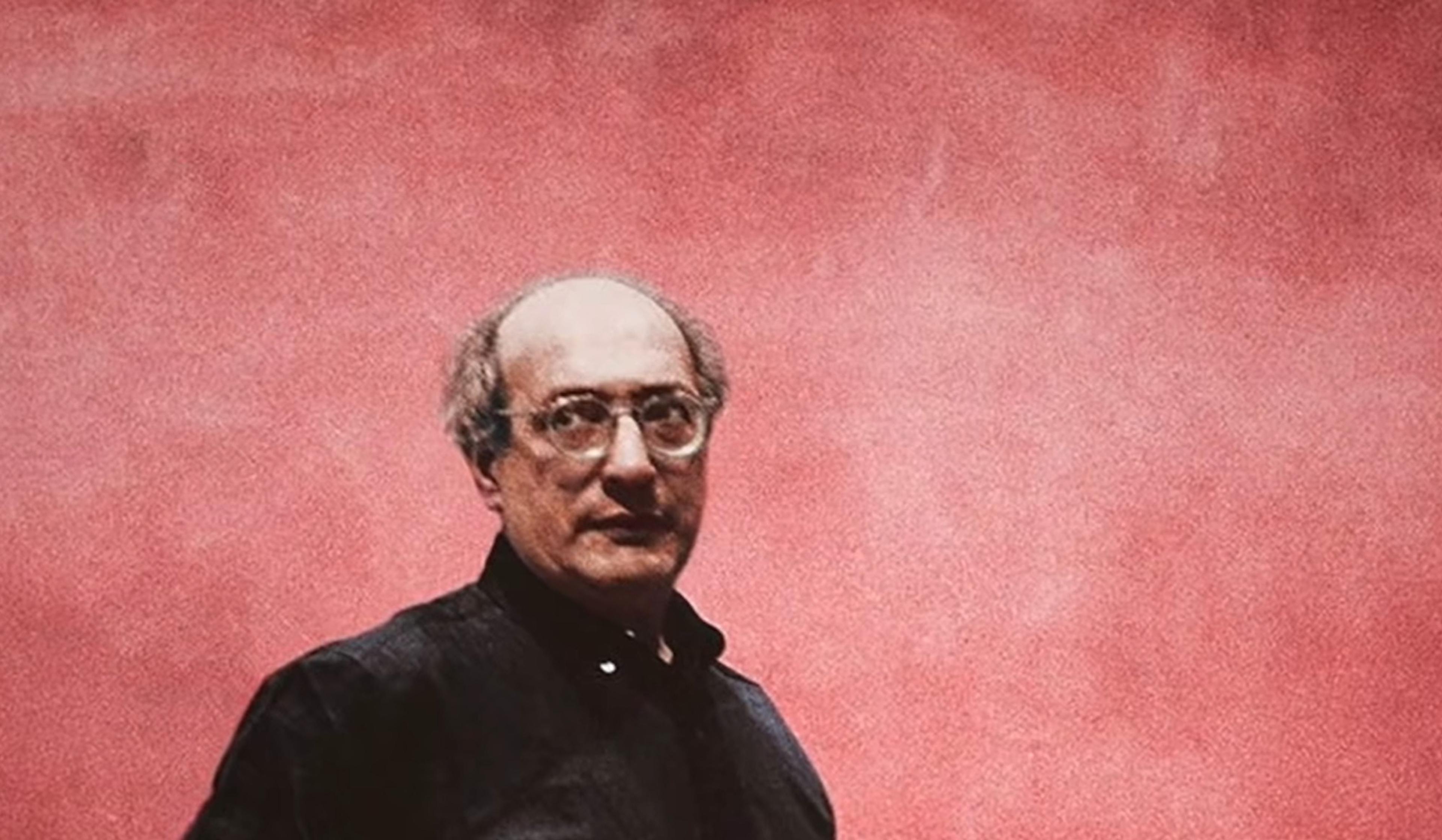
Can art in a swanky restaurant ever be transcendent? On Rothko’s Seagram Murals
15 minutes