In the face of the massive amount of new information people are forced to confront on a daily basis, data visualisation has emerged as a popular tool for making sense of the unceasing stream of increasingly complex sets of facts and figures. The Art of Data Visualisation features several experts dissecting why visualisations have become an indispensable means of communication, and why getting the design right is one of the quickest ways to deliver a nuanced yet comprehensible message.
Why data visualisation experts talk about truth, beauty, revelation and respect
Producers: Eric Brown, Lisa Romagnoli
Website: PBS Digital Studios
28 October 2015
videoInformation and communication
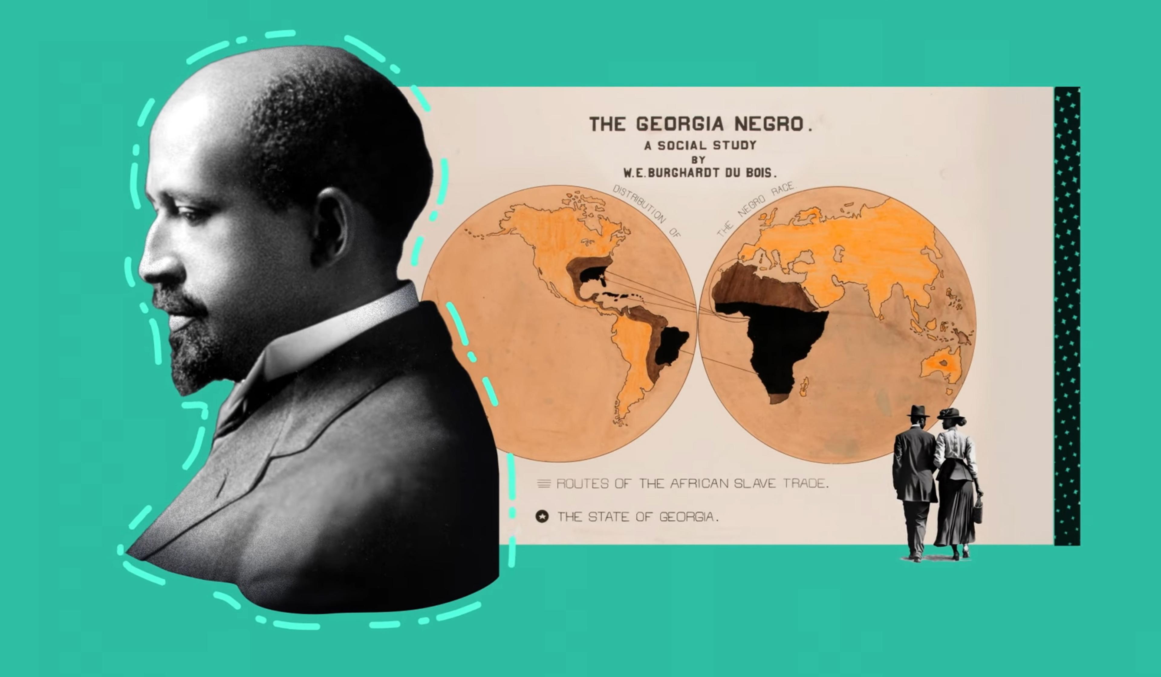
Mapping data visualisation’s meteoric rise from Victorian London to today
6 minutes

videoTechnology and the self
Can you get to know someone through visualisations of their personal data?
3 minutes

videoNeuroscience
Why daydreaming should replace multitasking amid our information overload
7 minutes

videoTechnology and the self
Algorithms are opinions, not truth machines, and demand the application of ethics
3 minutes

videoNeuroscience
How perception leaves the door open for augmented reality to transform our world
4 minutes

videoArt
Digital art can help us see and judge the internet before it consumes everything
6 minutes

videoDemography and migration
What can a map of notable births and deaths reveal about the spread of culture?
6 minutes

videoTechnology and the self
We need interactive media not for more thrills but to grasp our world better
6 minutes

videoDemography and migration
For a radical new perspective on immigration, picture the US as an ancient tree
6 minutes