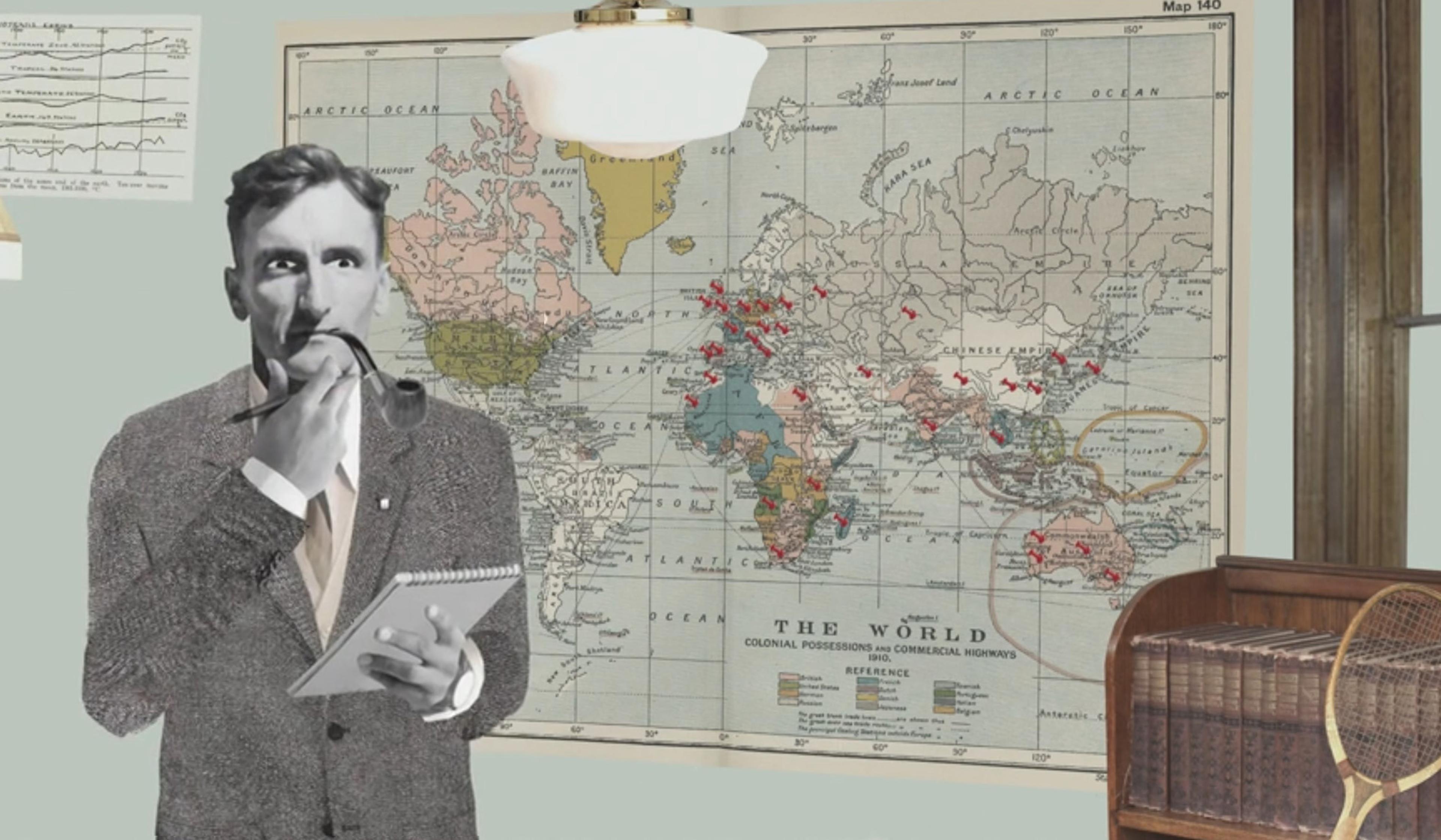
Today, data visualisation is ubiquitous, created and used by experts and laypeople alike to make sense of an increasingly intricate – and intricately measured – world. However, some 200 years ago, the notion that fanciful images could accurately represent hard data wasn’t taken seriously among scientists. This stylish animation walks viewers through two centuries of data visualisation. Moving from the physician John Snow’s cholera ‘dot map’ of London from 1854, to a disturbing instance of eugenic misinformation, to the ‘warming stripes’ charting today’s climate crisis, the video highlights five data visualisations that gave rise to the form, and changed the world.
Mapping data visualisation’s meteoric rise from Victorian London to today
Video by The Royal Society, BBC Ideas
20 April 2023

videoHistory of science
Why data visualisation experts talk about truth, beauty, revelation and respect
8 minutes

videoDemography and migration
What can a map of notable births and deaths reveal about the spread of culture?
6 minutes

videoTechnology and the self
Can you get to know someone through visualisations of their personal data?
3 minutes
videoEarth science and climate
Climate change science is centuries, not decades old, and it was pioneered by a woman
5 minutes

videoTechnology and the self
Algorithms are opinions, not truth machines, and demand the application of ethics
3 minutes

videoOceans and water
A stunning visualisation explores the intricate circulatory system of our oceans
5 minutes

videoNations and empires
Flying the flag with the tricolores, herring salads and cuadrilongas of the world
4 minutes

videoDemography and migration
For a radical new perspective on immigration, picture the US as an ancient tree
6 minutes
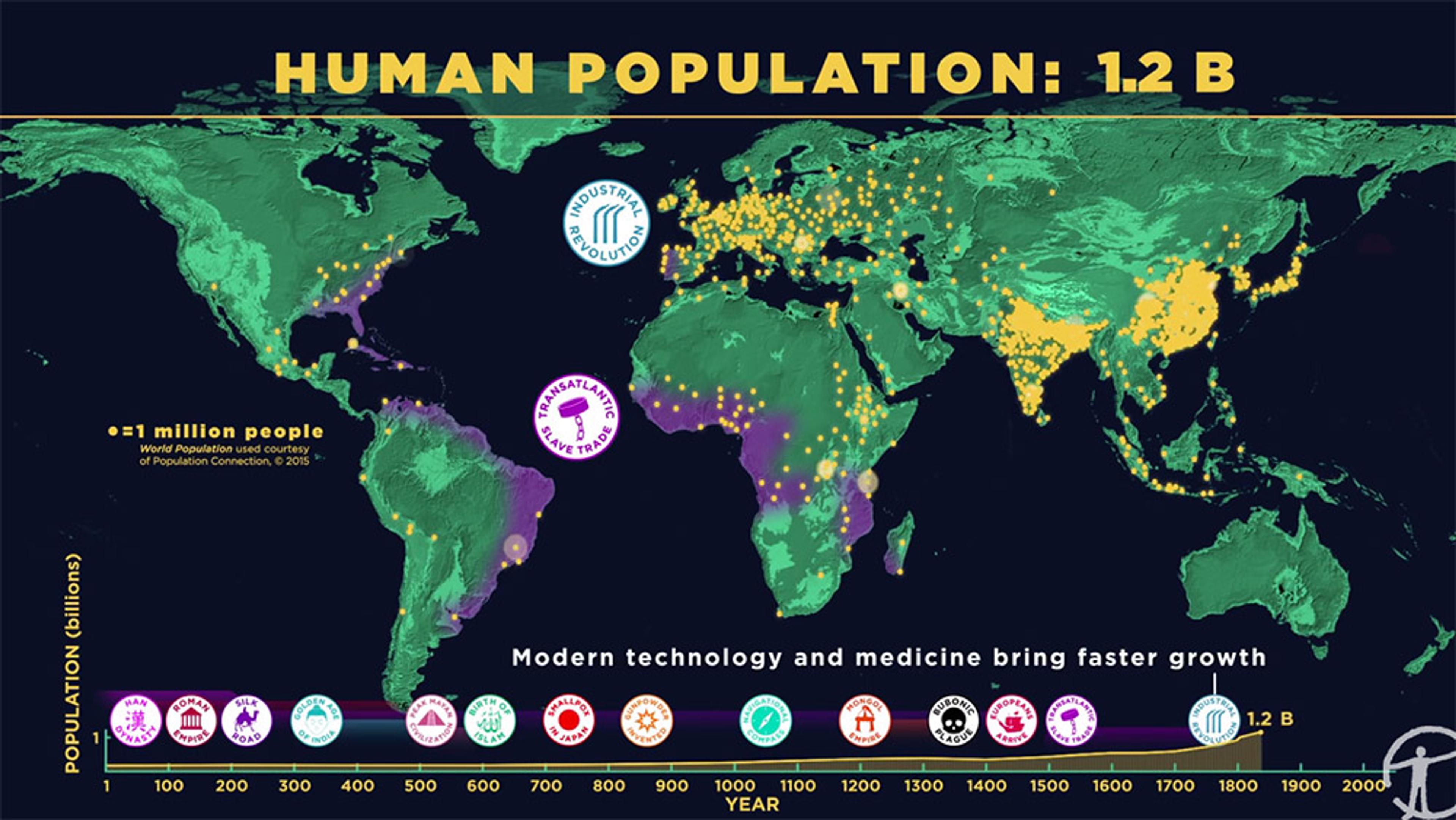
videoDemography and migration
How we became more than 7 billion – humanity’s population explosion, visualised
6 minutes