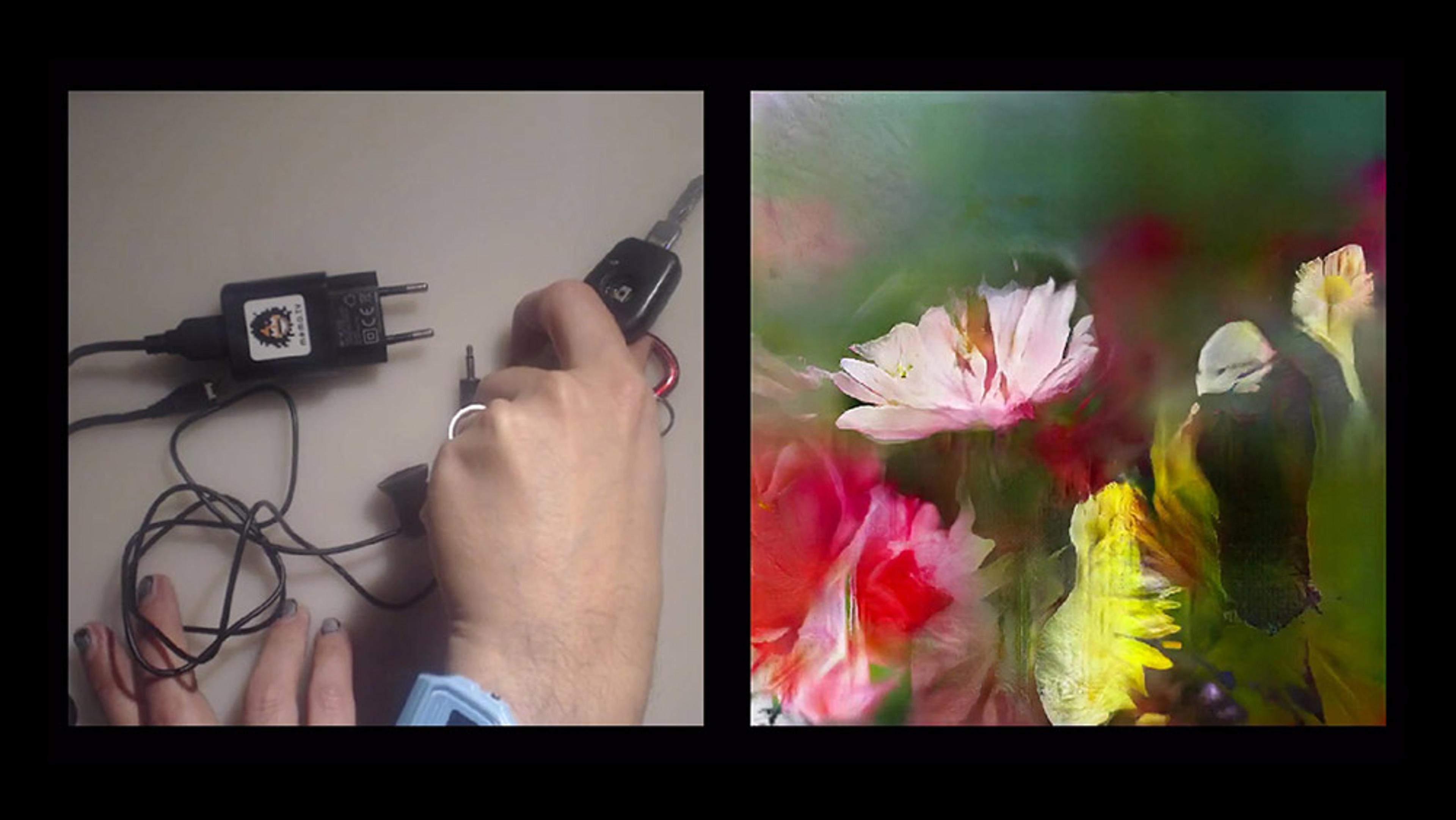
In 2013, the information designers Giorgia Lupi (living in New York City) and Stefanie Posavec (living in London) began a year-long project to get to know each other through hand-drawn data-centric postcards. Each weekly postcard communicated a different aspect of their lives through data visualisation, from the frequency they checked the time of day to the number of times their significant others ‘inspired love or inspired annoyance’. A brief but enlightening summary of Giorgia and Stefanie’s experience, Dear Data illuminates the potential (and shortcomings) of data-driven communication and suggests how visualisation can imbue even the most seemingly tedious facts and figures with emotion. See all of Giorgia and Stefanie’s postcards here.
Can you get to know someone through visualisations of their personal data?
Video by Giorgia Lupi and Stefanie Posavec
Animators: Alice Dunseath and Rosanna Wan
7 June 2016

videoHistory of science
Why data visualisation experts talk about truth, beauty, revelation and respect
8 minutes
videoInformation and communication
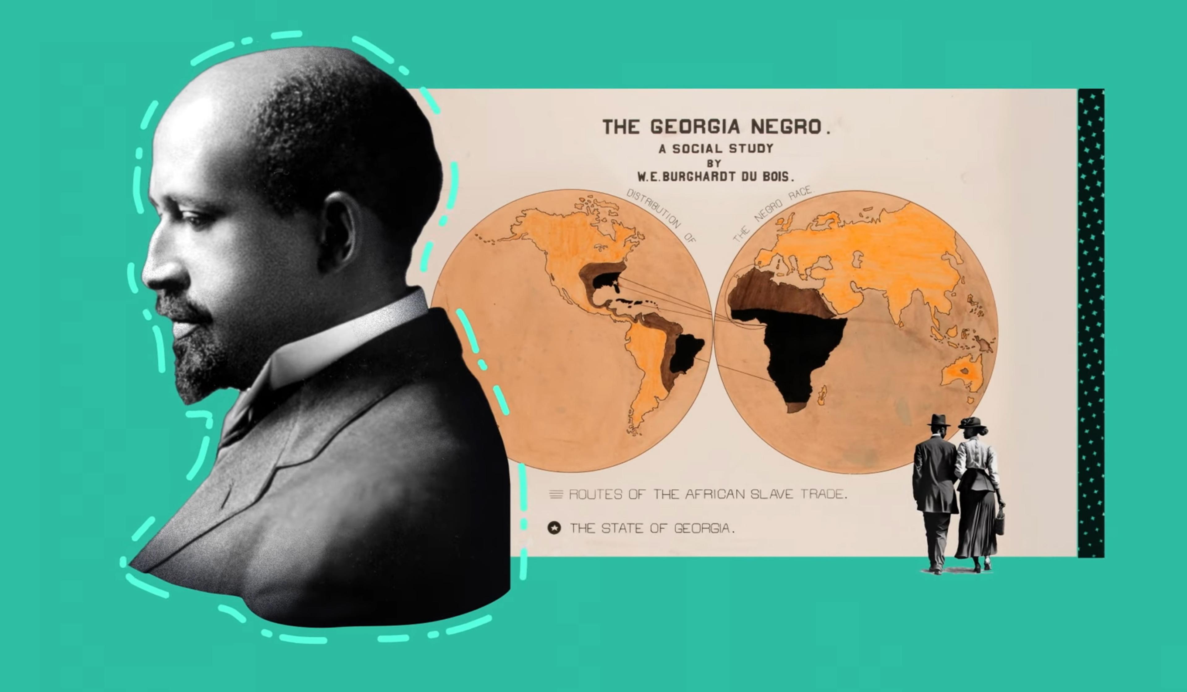
Mapping data visualisation’s meteoric rise from Victorian London to today
6 minutes
videoInformation and communication
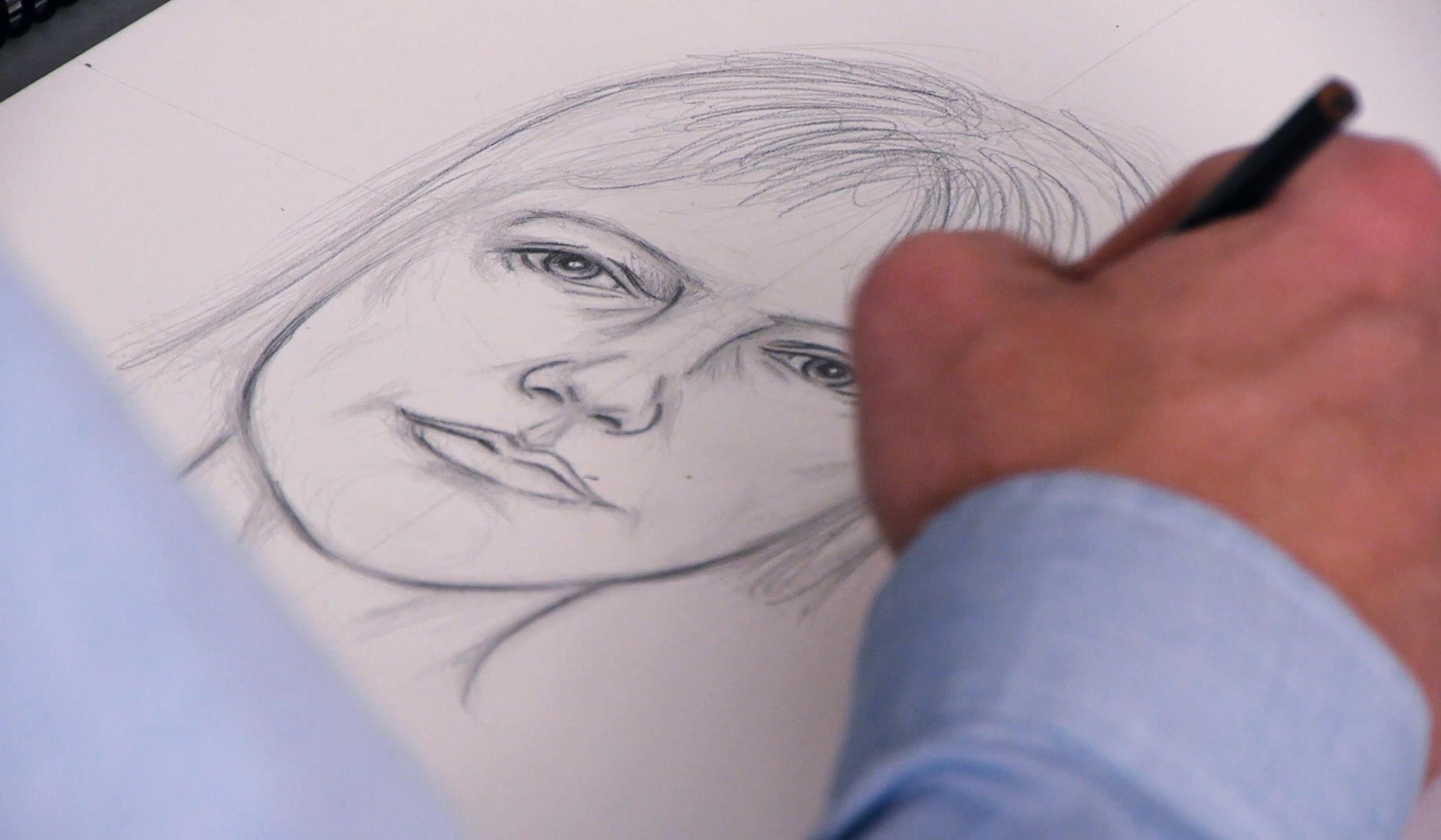
From mental image to sketch – how memories and emotions conjure up a face
23 minutes
videoPsychiatry and psychotherapy
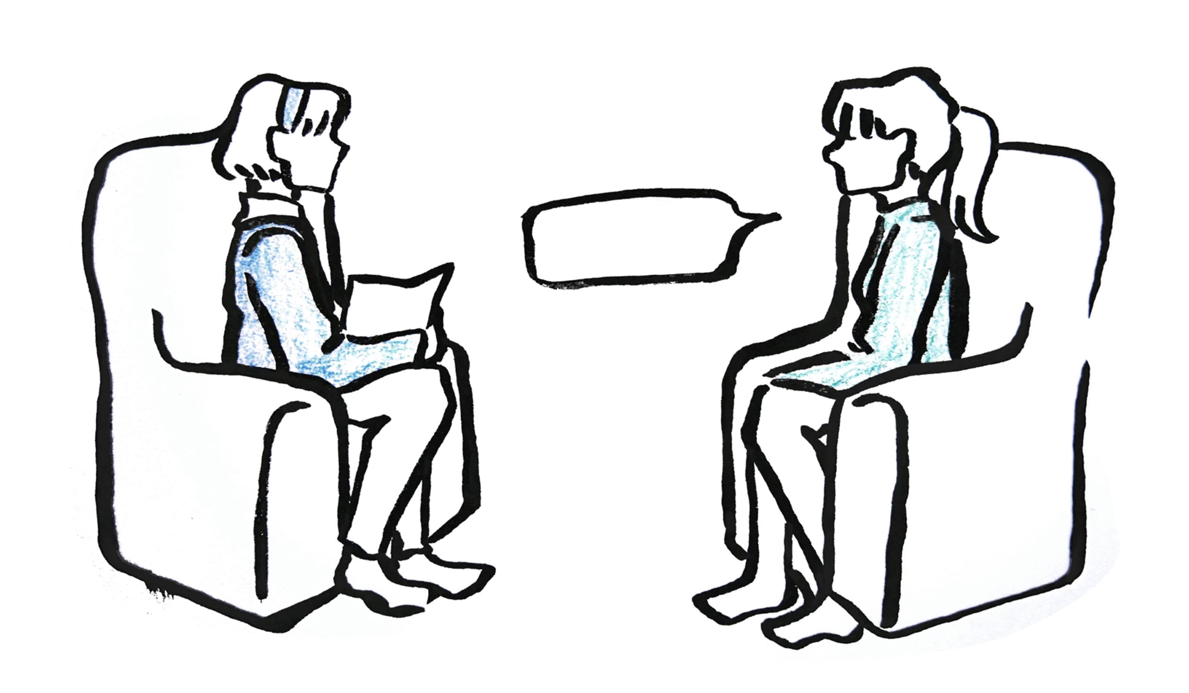
Pondering the peculiar one-sided intimacy of the client-therapist relationship
3 minutes
videoPersonality
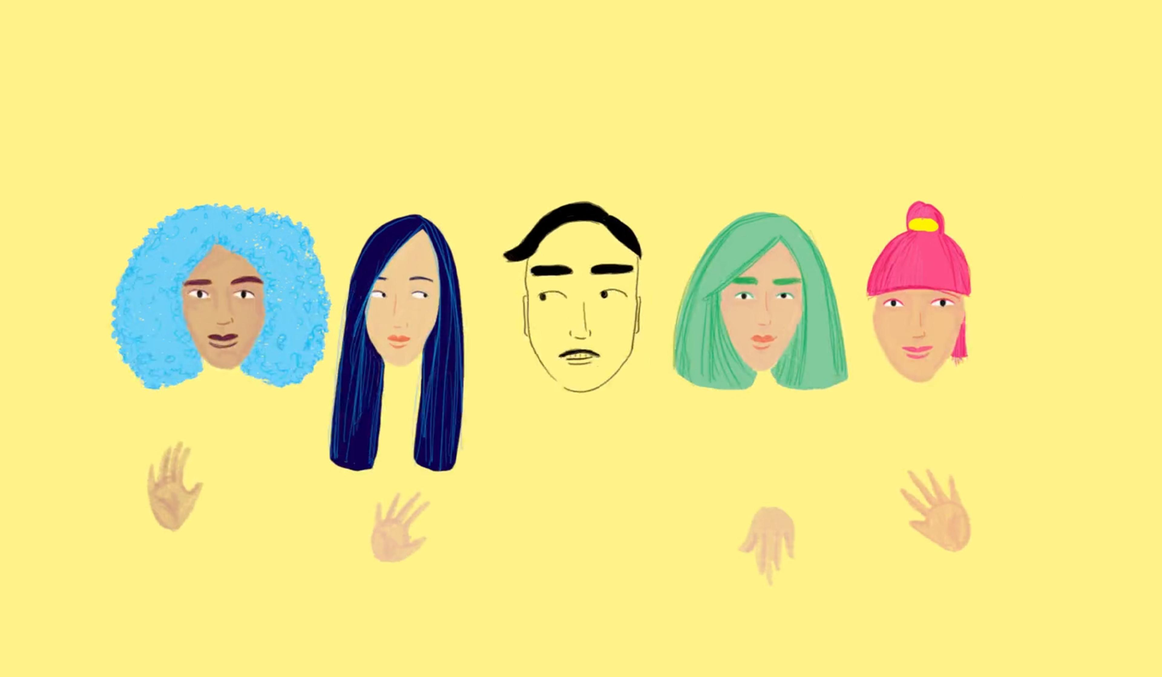
Art students divulge (and animate) the dating pet peeves they find unforgivable
3 minutes
videoComputing and artificial intelligence
A neural network that keeps seeing art where we see mundane objects
3 minutes
videoLove and friendship
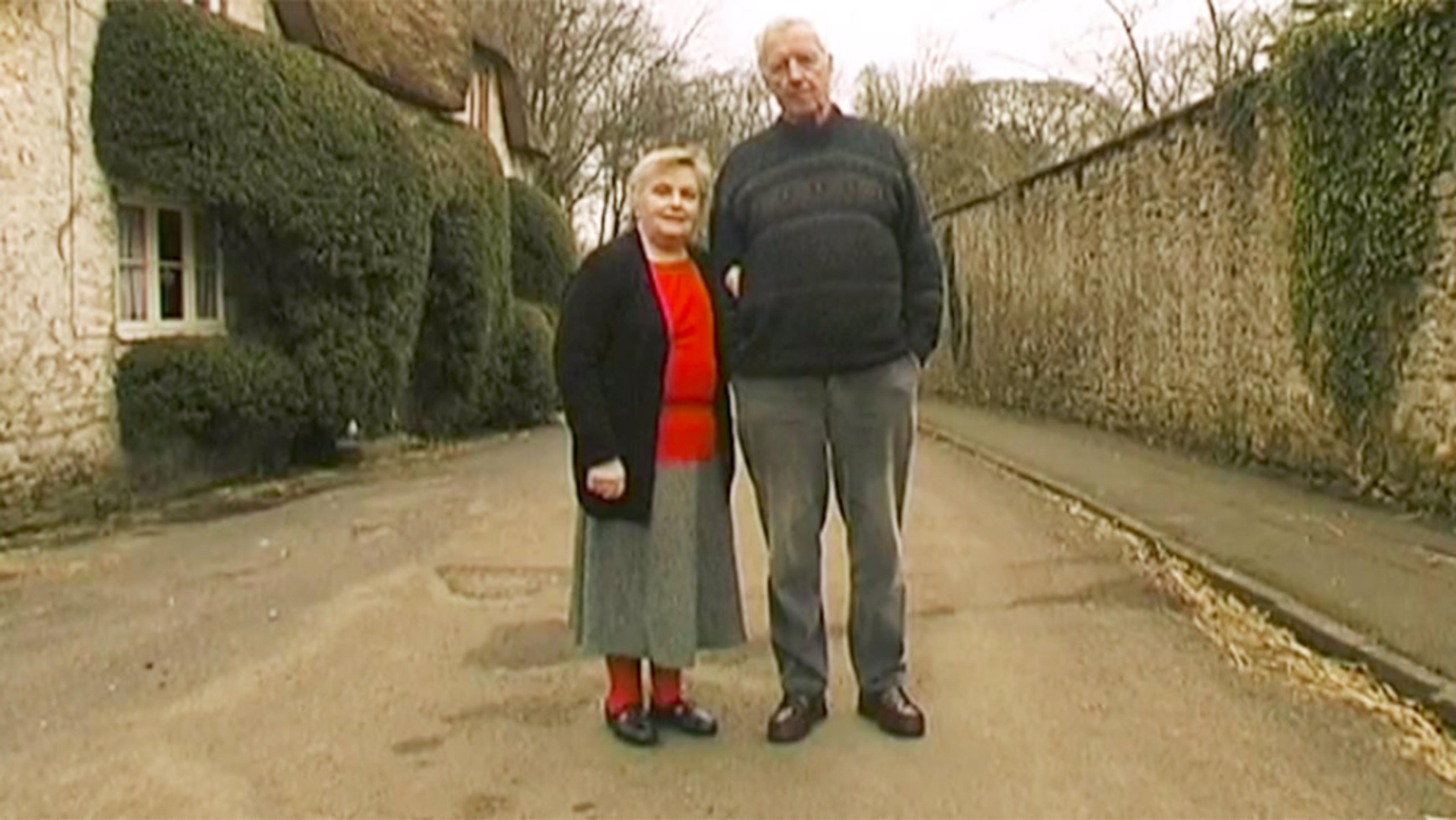
From a 77-year relationship to a first date – a brisk, cheery survey of love
3 minutes
videoTechnology and the self
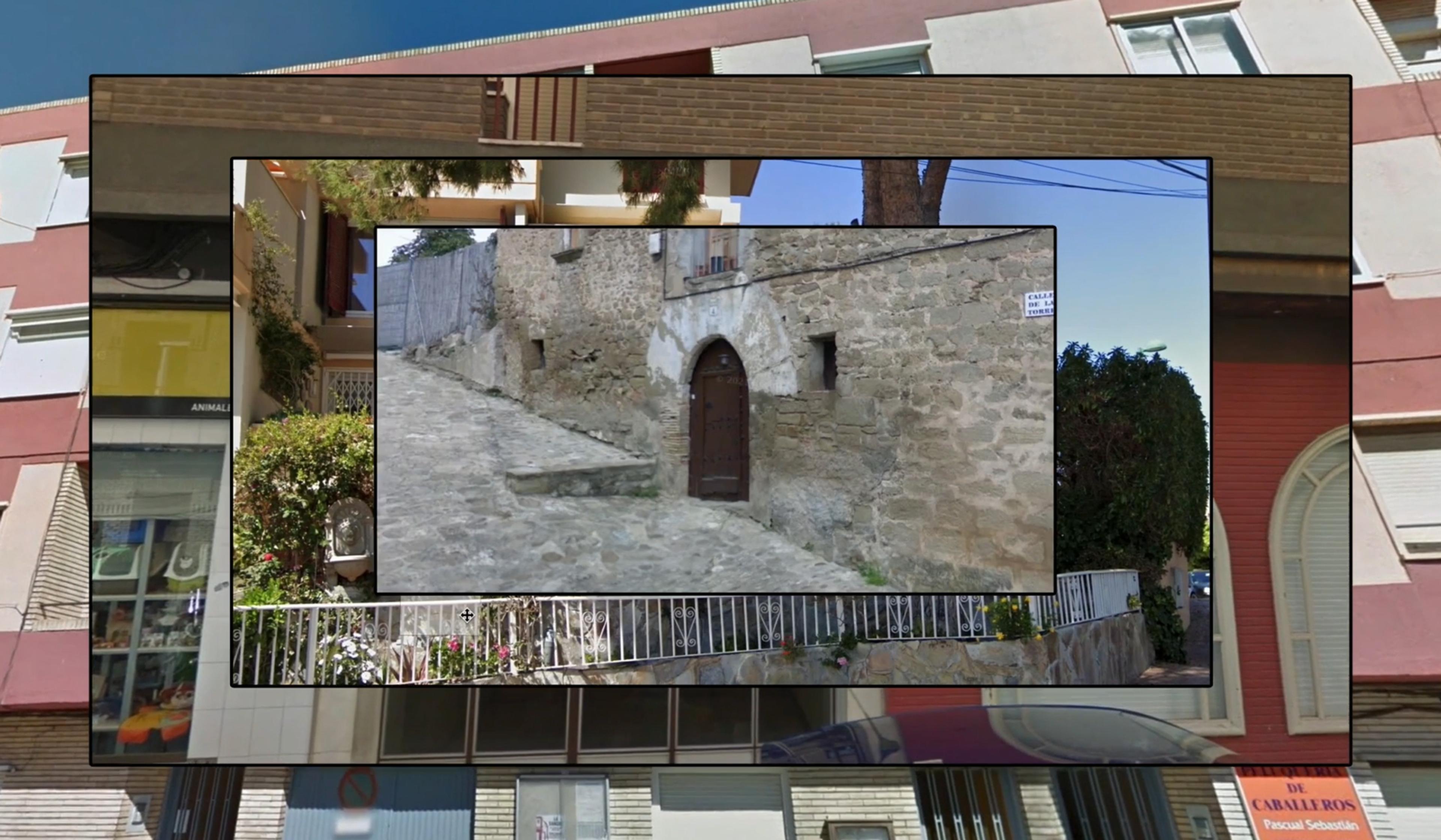
A ‘virtual outing’ on Google Maps reveals a treasured image from Diego’s past
6 minutes

videoLove and friendship
What people’s hand gestures reveal when they’re asked about love
9 minutes