It might have come to your attention that the United Kingdom is experiencing some difficulties over an issue called Brexit. The referendum on whether the UK should leave the European Union was held in June 2016, and the Leave campaign produced an iconic image of a big red bus plastered with the message: ‘We send the EU £350 million each week – let’s fund our NHS instead.’ The masterful meme combined an impressive-sounding amount of cash with an appeal to the National Health Service, a nearly sacred British institution. It is plausible that this brilliant use of numbers tipped the balance in favour of Leave, which to most people’s surprise went on to win by the narrow margin of 52 per cent to 48 per cent.
How reliable is the claim on the side of the bus? Like most numbers used in political discourse, the £350 million is not purely random or entirely fabricated – it does have some empirical basis. The agreed annual gross contribution to the EU in 2017 was £18.6 billion (£357 million a week), figures easily found in a publicly available spreadsheet. However, it is also true that a rebate of £5.6 billion is deducted from the British bill to the EU before payment. That brings the net figure to £13 billion. Further, around £4 billion comes back from the EU in terms of, for example, public sector science and agricultural funding and, presumably if it left the EU, the UK would need to pay for these itself.
Many criticised the Leave campaign for its claim that Britain sends the EU £350 million a week. When Boris Johnson repeated it in 2017 – by which time he was Foreign Secretary – the chair of the UK Statistics Authority (the official statistical watchdog) rebuked him, noting it was a ‘clear misuse of official statistics’. A private criminal prosecution was even made against Johnson for ‘misconduct in a public office’, but it was halted by the High Court.
The message on the bus had a strong emotional resonance with millions of people, even though it was essentially misinformation. The episode demonstrates both the power and weakness of statistics: they can be used to amplify an entire worldview, and yet they often do not stand up to scrutiny. This is why statistical literacy is so important – in an age in which data plays an ever-more prominent role in society, the ability to spot ways in which numbers can be misused, and to be able to deconstruct claims based on statistics, should be a standard civic skill.
Statistics are not cold hard facts – as Nate Silver writes in The Signal and the Noise (2012): ‘The numbers have no way of speaking for themselves. We speak for them. We imbue them with meaning.’ Not only has someone used extensive judgment in choosing what to measure, how to define crucial ideas, and to analyse them, but the manner in which they are communicated can utterly change their emotional impact. Let’s assume that £350 million is the actual weekly contribution to the EU. I often ask audiences to suggest what they would put on the side of the bus if they were on the Remain side. A standard option for making an apparently big number look small is to consider it as a proportion of an even bigger number: for example, the UK’s GDP is currently around £2.3 trillion, and so this contribution would comprise less than 1 per cent of GDP, around six months’ typical growth. An alternative device is to break down expenditure into smaller, more easily grasped units: for example, as there are 66 million people in the UK, £350 million a week is equivalent to around 75p a day, less than $1, say about the cost of a small packet of crisps (potato chips). If the bus had said: We each send the EU the price of a packet of crisps each day, the campaign might not have been so successful.
Numbers are often used to persuade rather than inform, statistical literacy needs to be improved, and so surely we need more statistics courses in schools and universities? Well, yes, but this should not mean more of the same. After years of researching and teaching statistical methods, I am not alone in concluding that the way in which we teach statistics can be counterproductive, with an overemphasis on mathematical foundations through probability theory, long lists of tests and formulae to apply, and toy problems involving, say, calculating the standard deviation of the weights of cod. The American Statistical Association’s Guidelines for Assessment and Instruction in Statistics Education (2016) strongly recommended changing the pedagogy of statistics into one based on problemsolving, real-world examples, and with an emphasis on communication.
If we are going to use real questions of interest to introduce statistical ideas, then we need to teach a basic structure for how data can be used to solve problems. I have been particularly inspired by the work in New Zealand on improving statistics education in schools; the figure below is theirs.
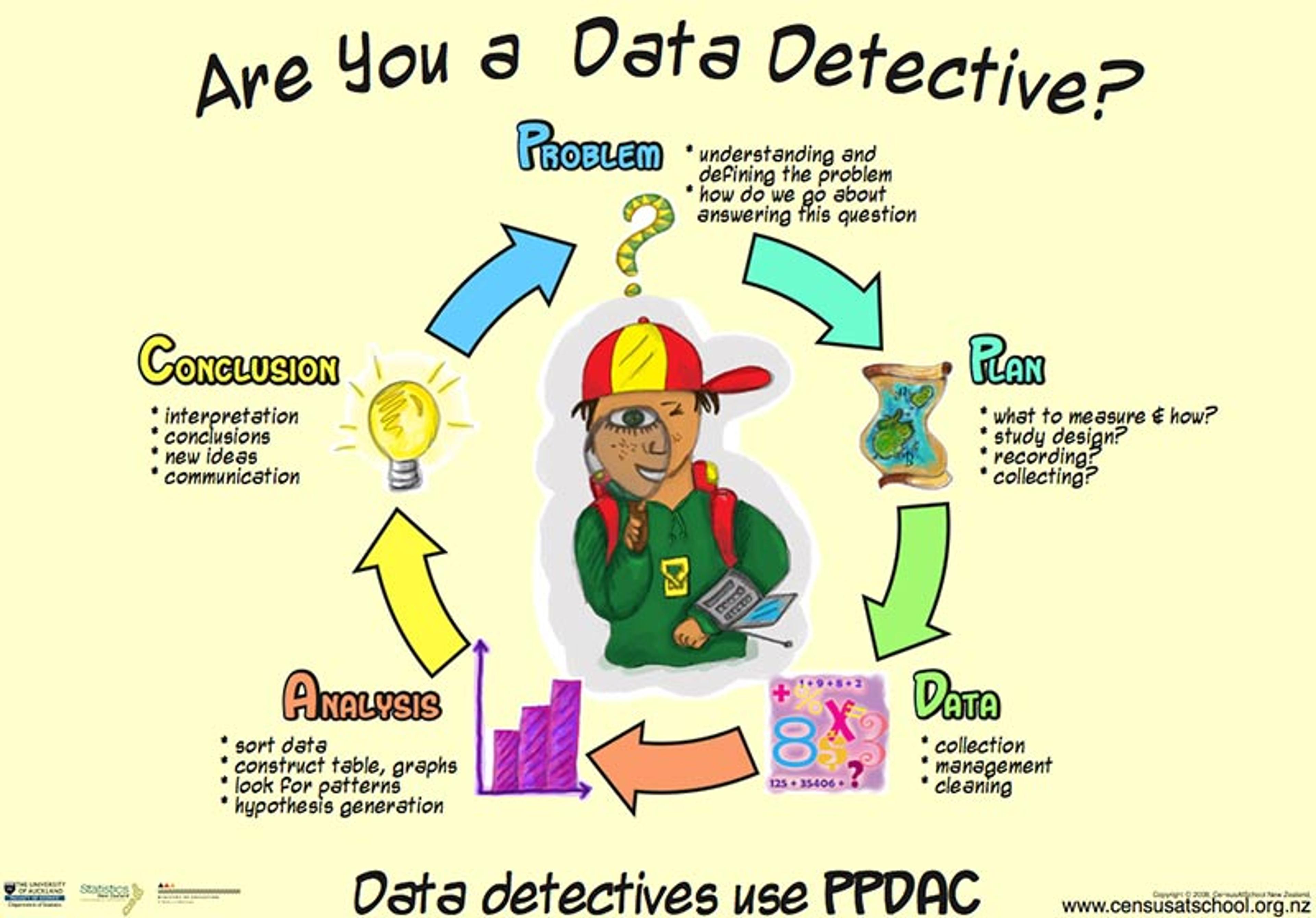
The problem-solving cycle: from problem to plan, to data, to analysis, to conclusion and communication (PPDAC), and starting again on another cycle.
Take this 2019 headline from CNN: ‘Eating Just One Slice Of Bacon A Day Linked To Higher Risk Of Colorectal Cancer, Says Study’. The British tabloid The Sun put it more baldly: ‘Rasher Of Bacon A Day Is Deadly’. So the problem might be: should I care about this risk and give up bacon? The plan is to delve deeper into the claims made in the article, which reveals that a study estimates that eating 25g of processed meat a day (equivalent to a large bacon sandwich every other day) is associated with a 19 per cent increased risk of bowel cancer.
For someone with basic training in statistical literacy, two questions should immediately come to mind. First, is this association actually causal – in other words, if people start eating bacon, will their risk go up? Or is it just association, in that people who tend to eat bacon also tend to get bowel cancer? It turns out that processed meats have been causally linked to bowel cancer by the International Agency for Research on Cancer, so we can take that on trust.
For one extra case of bowel cancer, 100 people need to eat 180 bacon sandwiches a year for life
The second question is whether this effect is large enough to merit my concern. The ‘19 per cent increase’ is a relative risk, and this form of expressing associations is known to exaggerate the apparent effect of exposing oneself to a risky substance such as bacon. The crucial question is – 19 per cent of what? Without knowing the baseline, absolute risk, we cannot know whether this increase is worth worrying about – after all, 19 per cent extra of hardly anything is still hardly anything. So the extra data we need is the absolute risks, and it turns out that around 6 per cent of people will get bowel cancer anyway, even if they don’t eat bacon. So what is a 19 per cent increase over 6 per cent?
Many reputable psychological experiments show that such calculations are better expressed using the idea of expected frequencies. In other words, what does it mean for 100 people? Well, out of 100 bacon non-eaters, we would expect six to get bowel cancer during their lifetime. Meanwhile, out of 100 people who ate 25g of bacon a day – say a large bacon sandwich every other day – then we would expect an extra 19 per cent to get bowel cancer: that’s 19 per cent of 6 per cent, which is around one extra, taking the total to seven. So, in order to get one extra case of bowel cancer, 100 people would need to eat around 180 bacon sandwiches a year for their whole life. This works out at around 10,000 each, or a total of 1 million great greasy bacon sandwiches. So your response to this story might be: pass the tomato ketchup.
Of course, I have deliberately expressed these results to make the risks look negligible, but it does put the claim and the headlines about killer bacon into perspective. Unfortunately, few people in the media are able to do these analyses themselves.
Harold Shipman was Britain’s most prolific convicted murderer, though he doesn’t fit the typical serial-killer profile. A mild-mannered family doctor, or general practitioner (GP), in a suburb of Manchester, between 1975 and 1998 he injected at least 215 of his mostly elderly patients with a massive opiate overdose. He finally made the mistake of forging the will of one of his victims so as to leave him some money: her daughter was a solicitor, suspicions were aroused, and forensic analysis of his computer showed that he had been retrospectively changing patient records to make his victims appear sicker than they really were. He was well-known as an enthusiastic early adopter of technology, but he was not tech-savvy enough to realise that every change he made was time-stamped (incidentally, a good example of data revealing hidden meaning).
Of his patients who had not been cremated, 15 were exhumed, and lethal levels of diamorphine – the medical form of heroin – were found in their bodies. Shipman was subsequently tried for 15 murders in 1999, but chose not to offer any defence, and never uttered a word at his trial. He was found guilty and jailed for life, and a public inquiry was set up to determine what crimes he might have committed apart from those for which he had been tried, and whether he could have been caught earlier. I was one of a number of statisticians called to give evidence at this public inquiry.
A first problem here is simply to understand the pattern of his activities: we can think of this type of iterative, exploratory work as ‘forensic’ statistics: no mathematics, no theory, just a search for patterns that might lead to more interesting questions. The plan is to examine whatever data is available from the public inquiry website, comprising details of each victim’s age, gender and date of death. The figure below is a visualisation of this data, showing a scatter-plot of each victim’s age against the date of death, with the shading of the points indicating whether the victim was male or female. Bar charts have been superimposed on the axes showing the pattern of ages (in five-year bands) and years: there is no formal analysis.
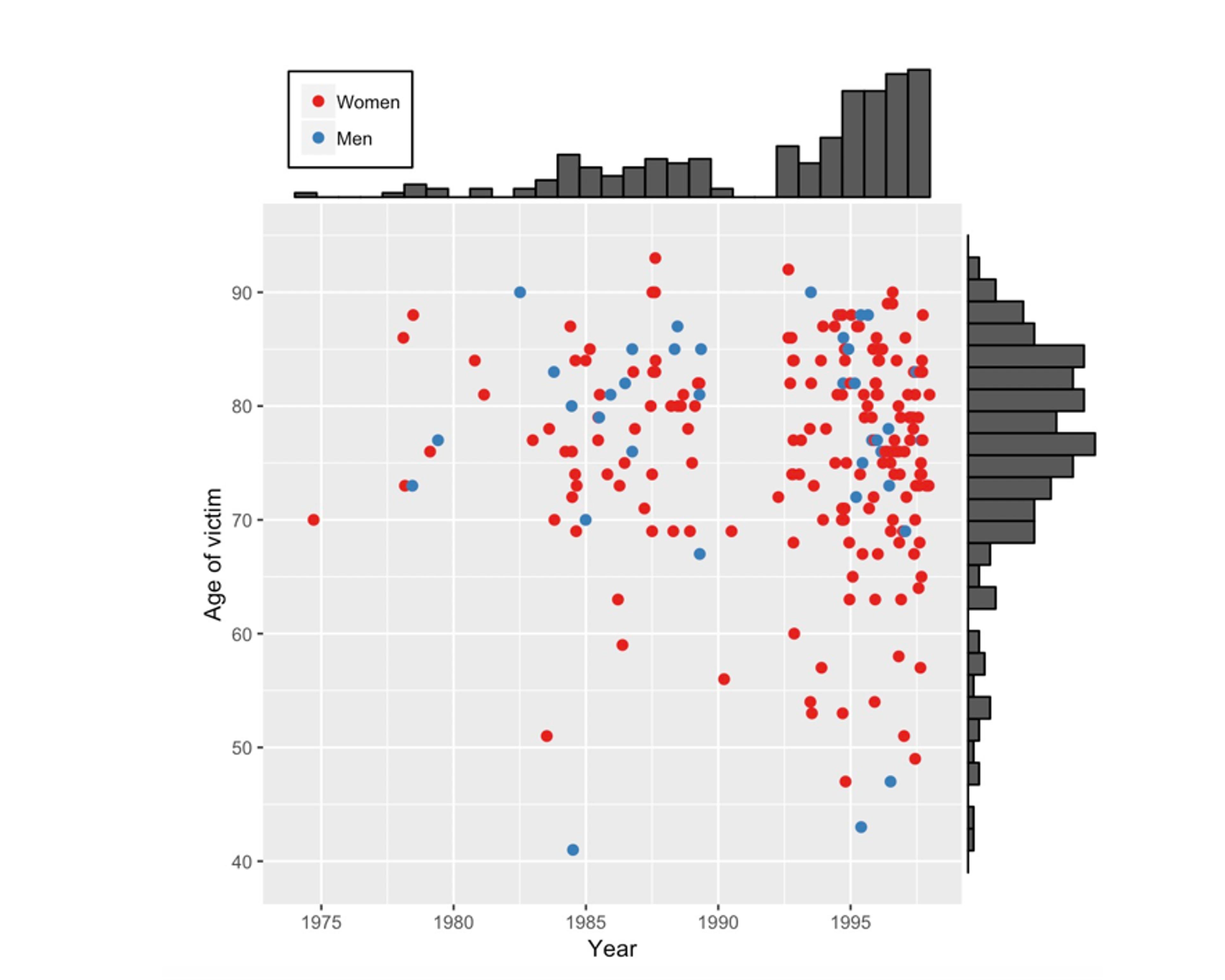
A scatter plot showing the age and the year of death of Shipman’s 215 confirmed victims. Bar charts have been added on the axes to reveal the pattern of ages and the pattern of years in which he committed murders.
Some conclusions can be drawn simply by taking some time to look at the figure. There are more red than blue dots, which means that Shipman’s victims were mainly women. The bar chart on the right shows that most of his victims were in their 70s and 80s, but looking at the scatter of points reveals that, although initially they were all elderly, some younger cases crept in as the years went by. The bar chart at the top clearly shows a gap around 1992 when there were no murders. It turned out that Shipman had previously worked in a joint practice with other doctors but then, possibly as he felt under suspicion, he left to form a single-handed general practice. After this, his activities accelerated.
Shipman performed his home visits after lunch, when he was generally alone with his elderly patients
This analysis of the victims identified by the inquiry raises questions about the way Shipman committed his murders. Some statistical evidence is provided by the time-of-day data on his supposed victims’ death certificates. Below is a line graph comparing the times of day that Shipman’s patients died, with the times that a sample of patients of other local family doctors died. The conclusion is sometimes known as ‘interocular’, since it hits you between the eyes. Shipman’s patients tended overwhelmingly to die in the early afternoon.
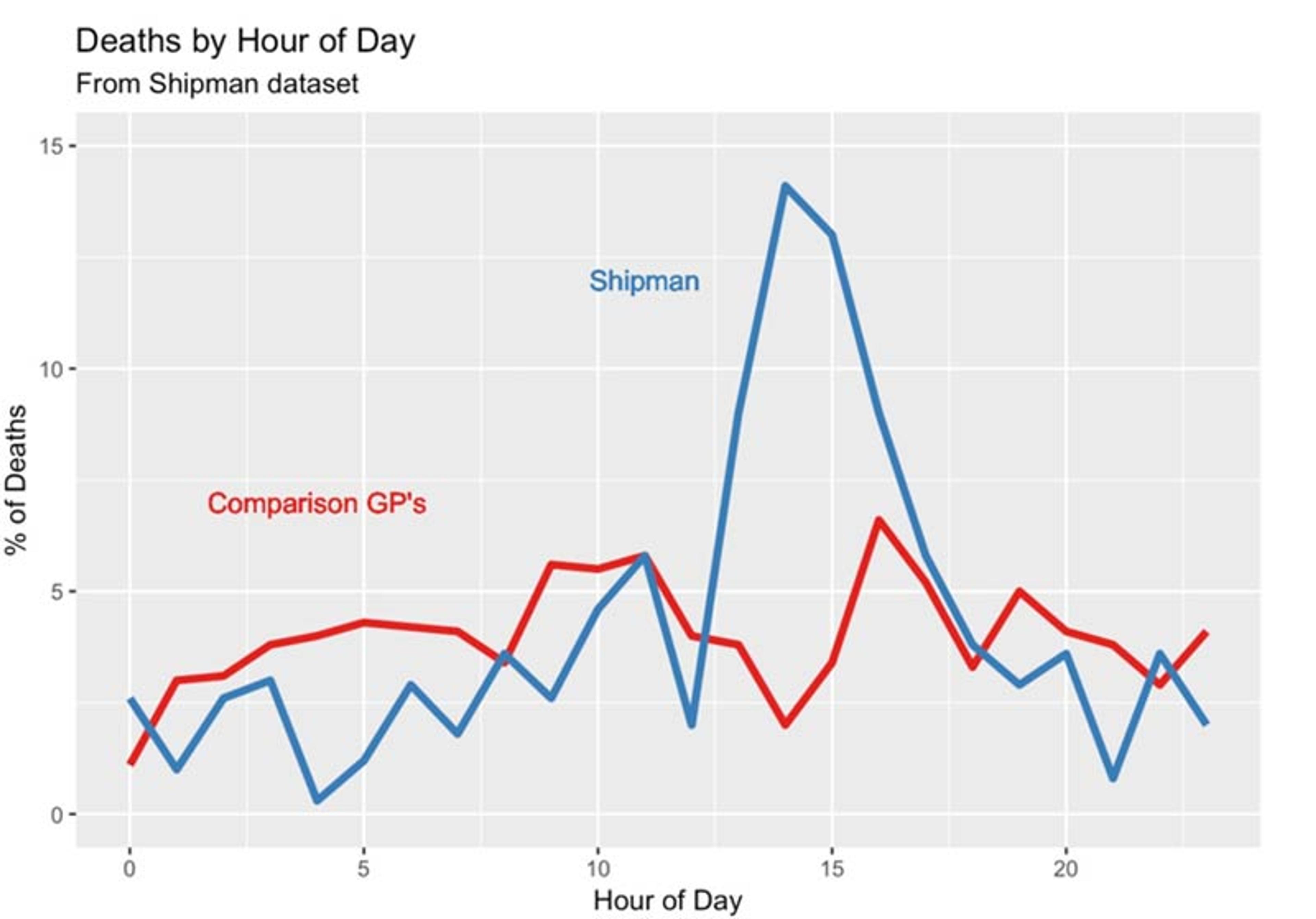
The time at which Harold Shipman’s patients died, compared to the times at which patients of other local general practitioners died. The pattern does not require sophisticated statistical analysis.
Further investigation revealed that Shipman performed his home visits after lunch, when he was generally alone with his elderly patients. He would offer them an injection that he said was to make them more comfortable, but that was in fact a lethal dose of diamorphine: the patient would die peacefully in front of him. Dame Janet Smith, who chaired the public inquiry, later said:
I still do feel it was unspeakably dreadful, just unspeakable and unthinkable and unimaginable that he should be going about day after day pretending to be this wonderfully caring doctor and having with him in his bag his lethal weapon … which he would just take out in the most matter-of-fact way.
He was taking some risk, since a single postmortem would have exposed him, but given the age of his patients and the apparent natural causes of death, none were performed. His reasons for committing these murders have never been explained: he never spoke about his misdeeds to anyone, including his family, and committed suicide in prison, conveniently just in time for his wife to collect his pension.
The main question the inquiry’s statisticians were asked was – could he have been identified earlier?
In advance of the inquiry, the number of death certificates that Shipman signed for people dying in their homes or in his practice since 1977 had been accumulated. We compared it with the number that would have been expected, given the age composition of all the patients under Shipman’s ‘care’ and the mortality rates for other local GPs. Making this sort of comparison controls for local conditions such as changing temperature and flu outbreaks. The figure below shows the expected number subtracted from the observed number of death certificates, accumulated from 1977 until Shipman’s arrest in 1998. This difference can be termed his ‘excess’ mortality.
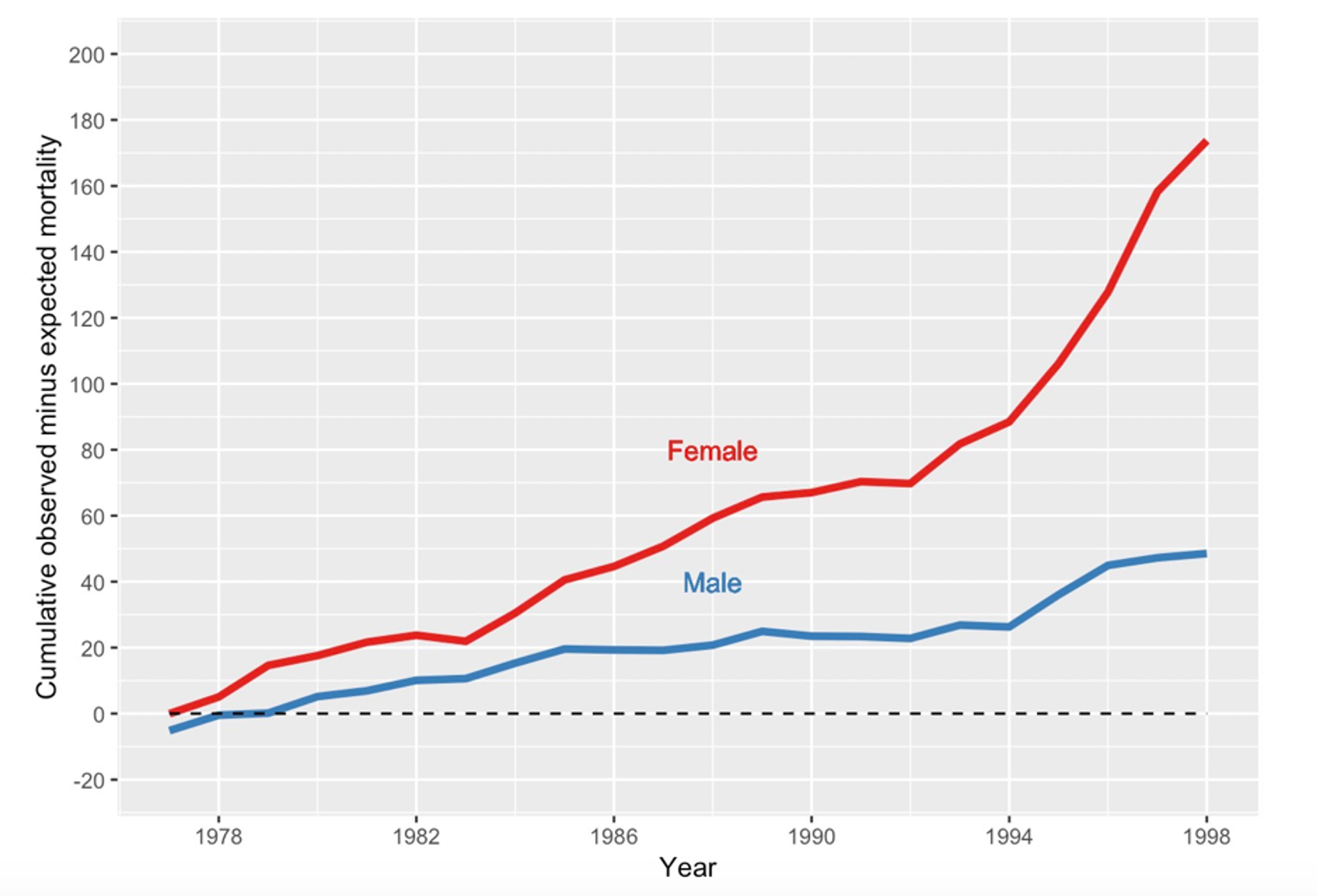
The cumulative number of death certificates signed by Shipman for patients who were age 65 or over and who died at home or in his practice. The expected number, given the composition of his practice list, has been subtracted.
By 1998, his estimated excess mortality for people aged 65 or over was 174 women and 49 men. This was almost exactly the number of older people that the inquiry later confirmed to be victims, showing the remarkable accuracy of this purely statistical analysis, for which no knowledge of individual cases had been included.
Supposing, in some fictitious history, that someone had been monitoring Shipman’s deaths year by year and doing the calculations necessary to produce figure 5, at what point might they have ‘blown the whistle’? This apparently innocuous question raises numerous challenging statistical issues related to formal tests of ‘statistical hypotheses’. My book The Art of Statistics (2019) contains a full (but nonmathematical) discussion of the issues, which are briefly summarised in the next paragraphs: warning, this gets a bit technical.
The standard approach is to set up a null hypothesis, say, that Shipman had the same underlying mortality rate as his colleagues, and so is completely normal. We then calculate a statistic that would indicate evidence against that hypothesis, and work out the probability of getting such an extreme value were the null hypothesis really true: the resulting P-value would be compared with an established threshold, say 0.05 or 0.01, and smaller P-values would lead to a claim of Shipman having a ‘statistically significant’ higher mortality rate. Essentially, if the data cannot be explained by chance alone, and so seems incompatible with the null hypothesis, then we declare that something strange is going on.
Had this process been actually carried out, then in 1979 – after only three years of monitoring – there would have been a P-value of 0.004 arising from comparing 40 observed deaths while only expecting 25.3. The results could have been declared ‘statistically significant’, and Shipman investigated and detected.
This so-called ‘null hypotheses significance-testing’ approach forms the basis of most scientific claims, including major discoveries such as the Higgs boson, although it has been a matter of important debate for years. But there are two reasons why such a statistical procedure would have been grossly inappropriate as a way of monitoring the mortality rates of GPs. First, unless there was some other reason to suspect Shipman and to set up a monitoring process for him alone, we would have been calculating such P-values for all the GPs in the UK – numbering around 25,000 at the time. We know that if we carry out enough significance tests we will get false signals. With 25,000 GPs tested at a critical threshold of 0.05, we would expect one in 20 utterly innocent doctors – around 1,300 – to be ‘significantly high’ each time the test was carried out, and it would be wrong to investigate all these people. And Shipman might be lost in all these false-positives.
The second problem is that we are carrying out repeated significance tests, as each year’s new data are added and another test performed. Fortunately, it turns out that there is some remarkable but complex theory, delightfully known as ‘the law of the iterated logarithm’. This shows that if we carry out such repeated testing, even if the null hypothesis is true, then we are certain to eventually reject that null at any significance level we choose.
An investigation and prosecution at that time could have saved around 175 lives
This is worrying. It means that if we keep testing a doctor for long enough, then we are guaranteed to eventually think we have found evidence of excess mortality, even if in reality it’s not there. Fortunately, there are statistical methods for dealing with this problem of sequential testing. They were first developed in the Second World War by teams of statisticians working on industrial quality-control of armaments and other war materiel.
Armaments coming off the production line were being monitored by steadily accumulating total deviations from a standard, much in the same way as monitoring excess mortality. Scientists realised that the law of the iterated logarithm meant that repeated significance testing would always lead eventually to an alert that the industrial process had gone out of strict control, even if in truth everything was functioning fine. Essentially, if we keep on checking on a process, in the end something will look odd just by chance alone.
Statisticians in the US and the UK, working independently, developed what became known as the sequential probability ratio test (SPRT), which is a statistic that monitors accumulating evidence about deviations. The key is that it can at any time be compared with simple thresholds – as soon as one of these thresholds is crossed, it triggers an alert to investigate the production line. Abraham Wald in the US and George Barnard in the UK led the statisticians – Barnard was a delightful man, a pure mathematician (and communist) before the war, who later went on to develop the official British Standard 3704 for condoms. Such techniques led to more efficient industrial processes, and were later adapted for use in so-called sequential clinical trials in which accumulated results are repeatedly monitored to see if a threshold that indicates a beneficial treatment has been crossed.
A team of us developed a version of the SPRT to apply in the Shipman inquiry. We concluded that if someone had been doing this monitoring then, just looking at female deaths, Shipman would have crossed a very stringent threshold in 1984. An investigation and prosecution at that time could have saved around 175 lives, but the inquiry decided that nobody could have been blamed for not applying this simple statistical monitoring device earlier – the data were not available. Moreover, who would think that an avuncular GP would be systematically murdering his patients?
Later, a monitoring system for GPs was piloted, which immediately identified a GP with even higher mortality rates than Shipman! Investigation revealed that this doctor practised in a south-coast town with a large number of retirement homes with many old people, and he conscientiously helped many of his patients to remain out of hospital for their deaths. It would have been completely inappropriate for this caring GP to receive any publicity for his apparently high rate of signing death certificates. The important lesson is that, while statistical systems can detect outlying outcomes, they cannot offer reasons why these might have occurred. What happened is one matter, why it happened can be very different. So statistical evaluation requires careful implementation in order to avoid false accusations. Another reason to be cautious about algorithms.
The Shipman story illustrates the two complementary components of statistical literacy. First is the ability to carry out statistical investigations leading to clear communication of what the data reveals. The second vital component is the ability to read about a claim based on data, while also having an idea of how to critique the numbers and a sense of which questions to ask. Statistics often give some answers, but they generally raise even more questions.
This kind of statistical literacy is difficult to teach. It cannot be reduced to formulae and algorithms – it is best learned through repeated experience and mentoring, almost as an apprenticeship. It takes time and effort to learn the art of statistics.
This is an edited extract from the book ‘The Art of Statistics’ by David Spiegelhalter. Copyright © 2019 by David Spiegelhalter. Reprinted by permission of Basic Books, New York, NY. All rights reserved.

